Ted Kaye wrote the book, Good Flag, Bad Flag: How to Design a Great Flag, and as I shared in my TED Talk, Why city flags might be the worst-designed thing you’ve never noticed, he came up with five basic principles for designing a great flag (and almost anything else):
- Keep it simple, so simple a child can draw it from memory.
- Use meaningful symbolism.
- Use two to three basic colors.
- No lettering or seals of any kind.
- Be distinctive or be related.
Sticking to these principles does not, sadly, guarantee that you’ll design a great flag (or anything else), but it’s a good start. However, as with all design, there are always outliers that violate the conventional principles, and still manage to delight and inspire. So, here are seven of my favorite flags that totally break the rules — and in doing so make the world a more interesting place. After all, all rules are made to be broken, design rules more than most.
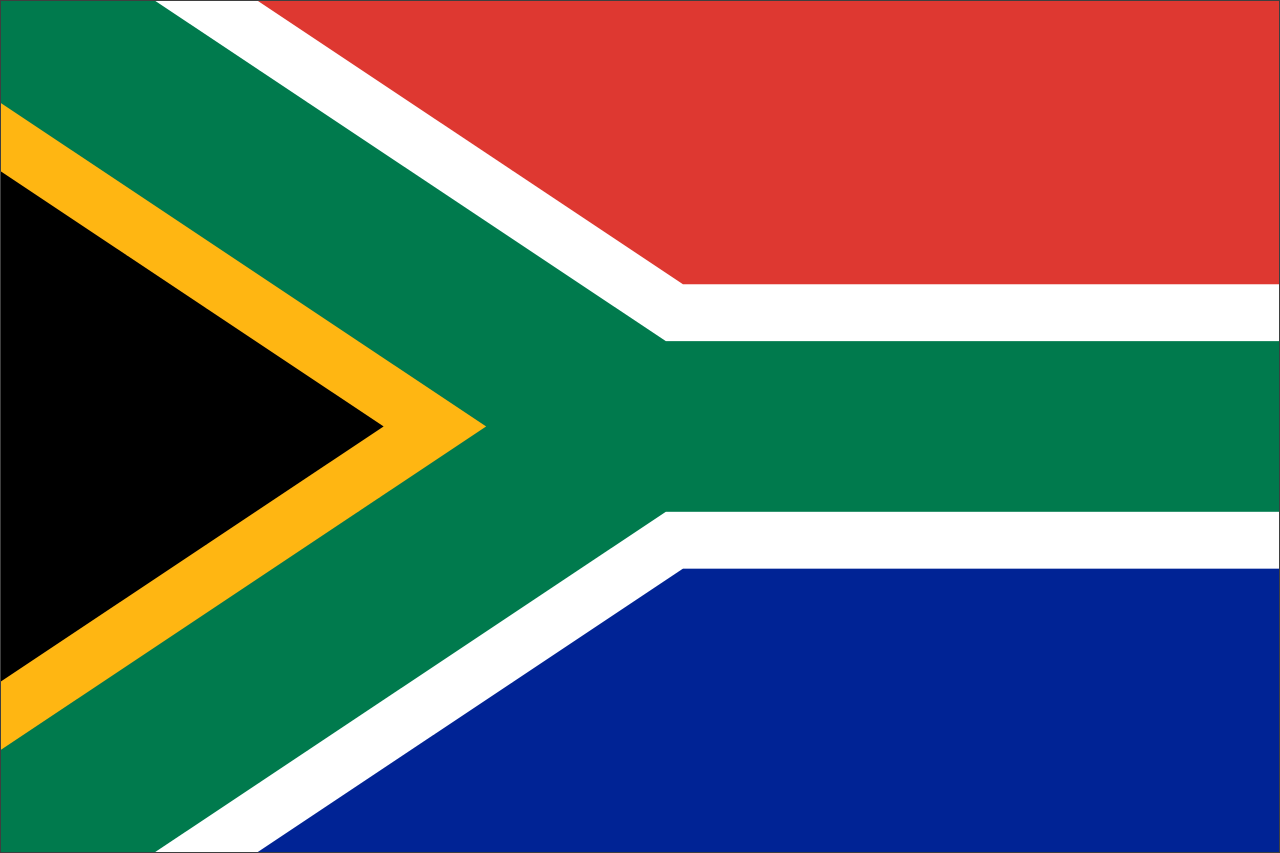
1. South Africa: Multi-colored gorgeousness
South Africa’s is a great flag, but its six colors put it in violation of Kaye’s principle #3. Adopted in 1994, it gracefully combines the color schemes of the African National Congress and the British and Dutch flags. All the colors (and the history linked to them) converge on the flag and point to a new future for South Africa. Despite the rogue additional color, the flag is simple, striking and memorable.
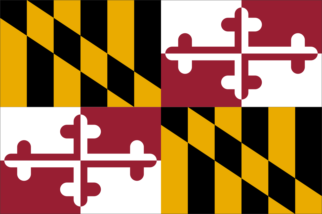
2. Maryland: A beautiful mess
This design is the heraldic banner of George Calvert, Lord Baltimore, who helped found Maryland. It’s not simple — no child could possibly draw this from memory — but the striking combination of the gold and black Calvert coat of arms along with the red and white Crossland coat of arms (representing Lord Baltimore’s paternal and maternal family, respectively) rocks my world.
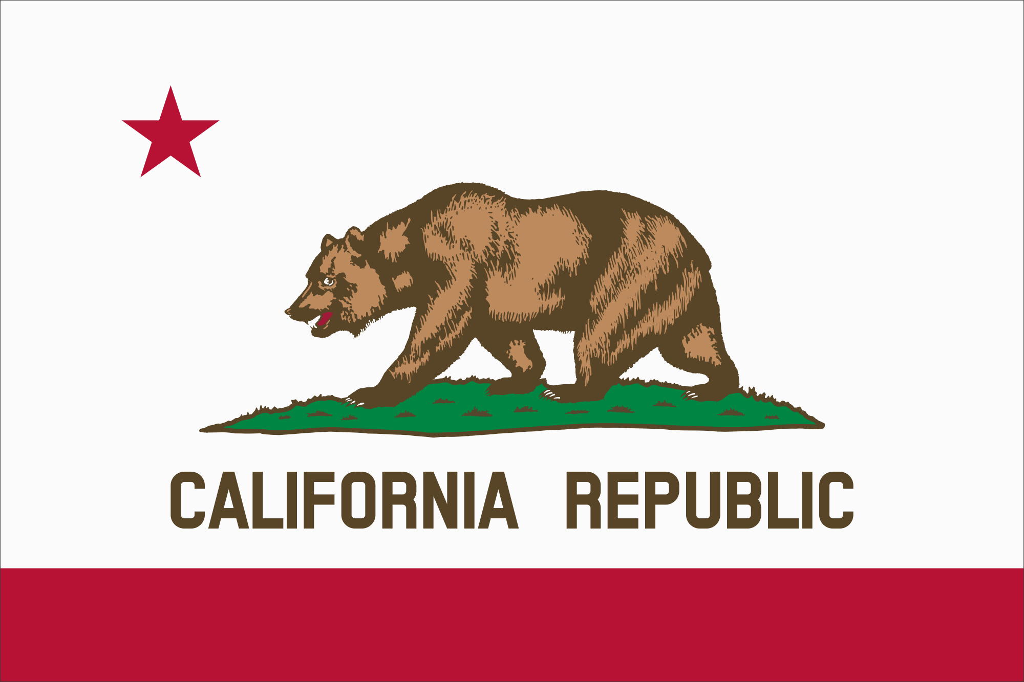
3. California: A bold republic rises
Lettering is a no-no on a flag. As Ted Kaye puts it, “if you need to write the name of what you’re representing on your flag, your symbolism has failed.” This flag doesn’t need the lettering, but I’m also certain there’s something about the anachronistic moniker of “California Republic” that makes the California state flag resonate with its citizens.
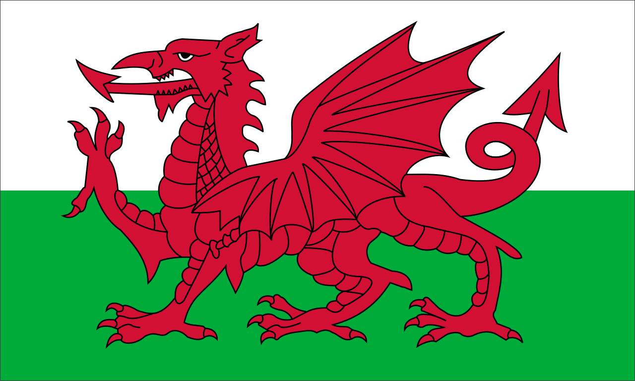
4. Wales: Flagrant rule-breaking
The dragon on the Welsh flag has a few too many details to qualify as “simple” in my book, but as someone on Twitter wrote me, “If the Welsh flag breaks the rules, then the rules are crap.” I hear ya.
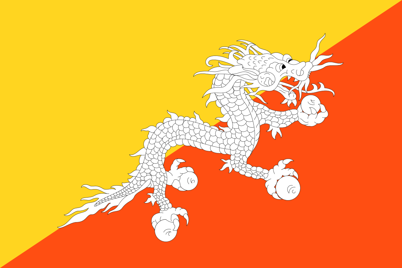
5. Bhutan: An awesome dragon
This flag also has far too many details, and therefore loses its power when seen from a distance, but f*&! it, that’s an awesome dragon!
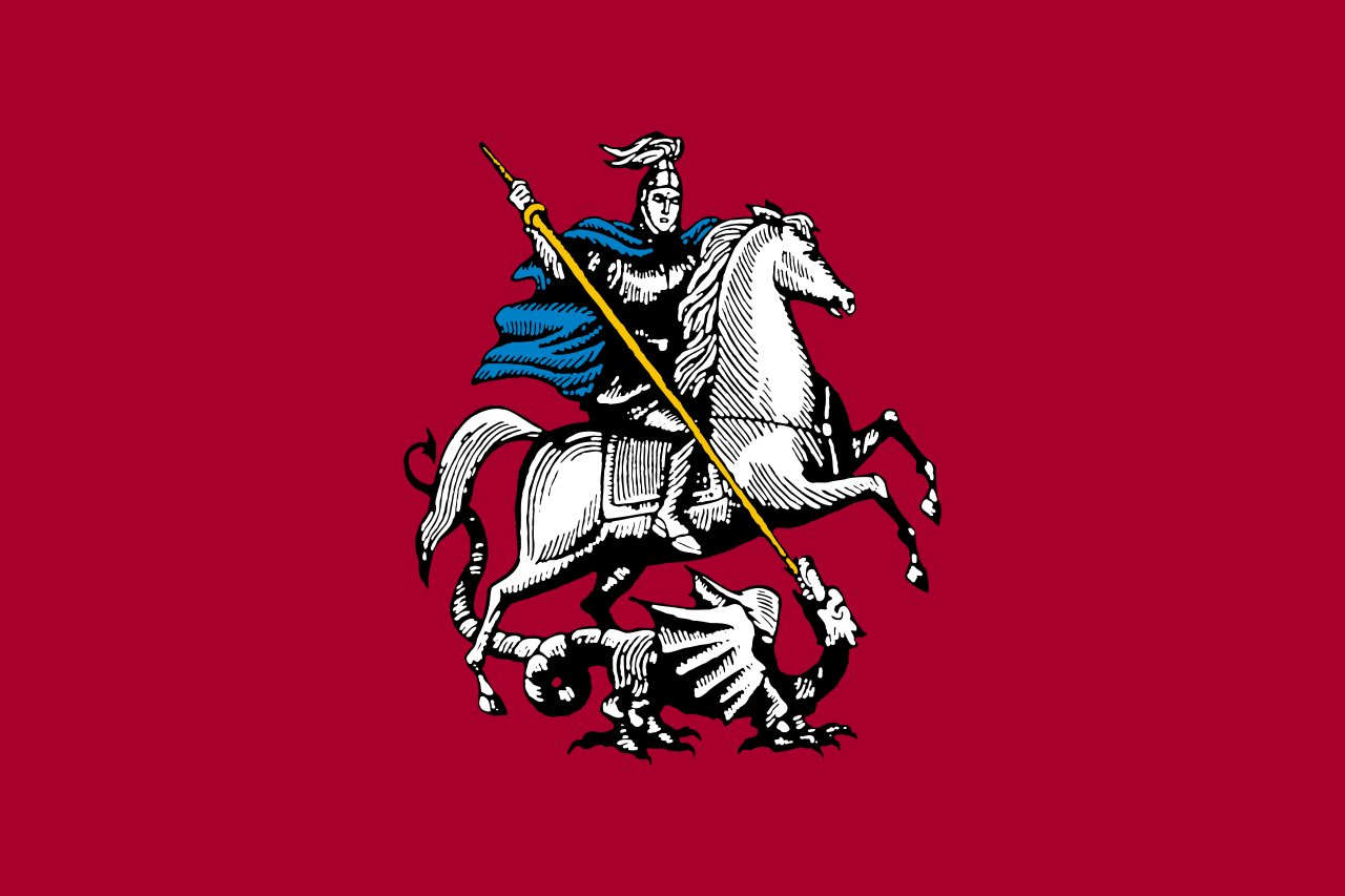
6. Moscow: A city favorite
After the TED Talk was published, a Muscovite sent me her flag and said that though it may break some rules, Moscow loves its flag. I think that’s great. Loving your flag is the only rule that really matters. The other five are just a method to get you there. Plus, that dude’s slaying a dragon!
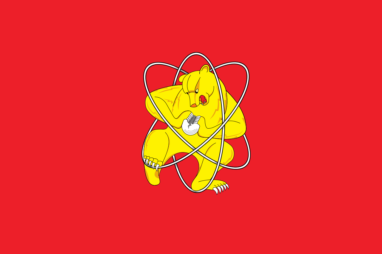
7. Zheleznogorsk: Behold, the insane flag of a secret city
Hell yes! The “secret” city of Zheleznogorsk in Russia was founded in 1950 to make weapons-grade plutonium for the USSR. The flag featuring a Russian bear splitting an atom might be too complex for a child to draw easily, but every child who sees it will want to draw that flag! It would also make a great t-shirt, poster, sticker, album cover, tattoo…