Social geographer Danny Dorling explodes the traditional maps of the world and creates lively, ever-changing depictions of why and how we live.
Channeling our twin urges to explore and understand, we geographers strive to uncover the hidden connections of human existence. These seven maps — produced with cartographer Benjamin Hennig — offer new ways to understand how we got to where we are today and where we are collectively headed. And just as these maps help re-envision our planet, could they also help us shift our mental map to one that guides toward building a better future for all of humanity?
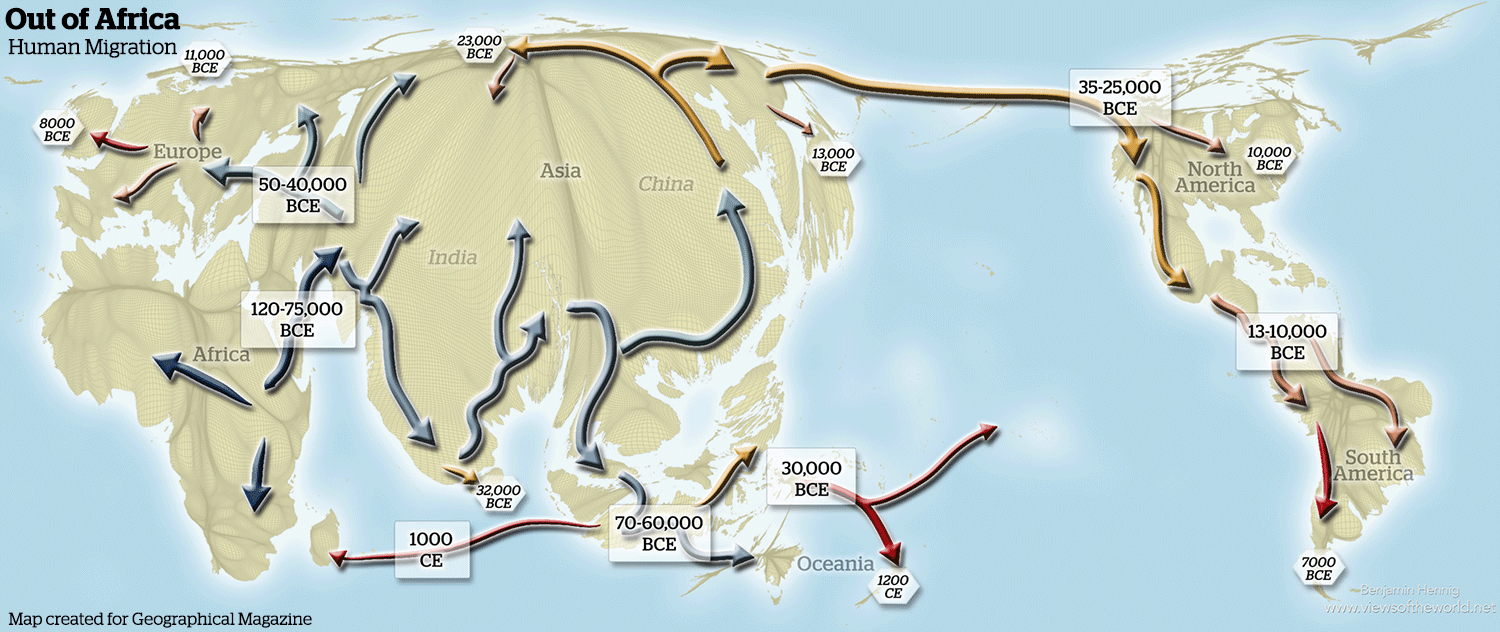
Where do we come from? Where did we go?
This map illustrates the migration of humanity across the Earth, with all movement originating in Africa and with estimated dates of arrival shown at various locations. It is drawn over a base map that reflects the population density of humanity today. We have to redraw this map every few months, because people keep making new discoveries about human origins.
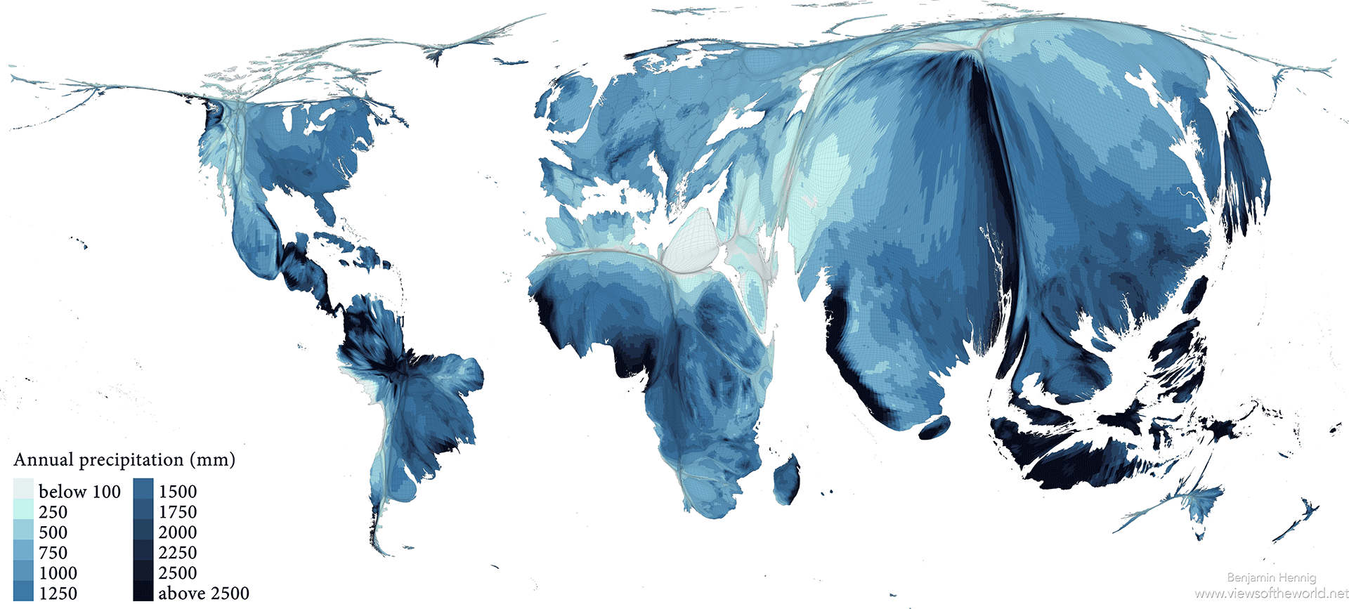
Our watery world
Some things matter more than money. Across the world, water — both in terms of availability and quality — is the resource that defines the capability of people to develop. Water is an unequally distributed resource, and the clearest way to appreciate this is to look at this cartogram showing where the water falls on our planet. It represents the world where people live (area on the map is proportional to population), and annual precipitation is overlaid on it. By studying the relationship between these two variables, population and precipitation, it is possible to identify where the water-supply challenge is at its most potentially acute. That appears to be in Egypt, Palestine and Pakistan.
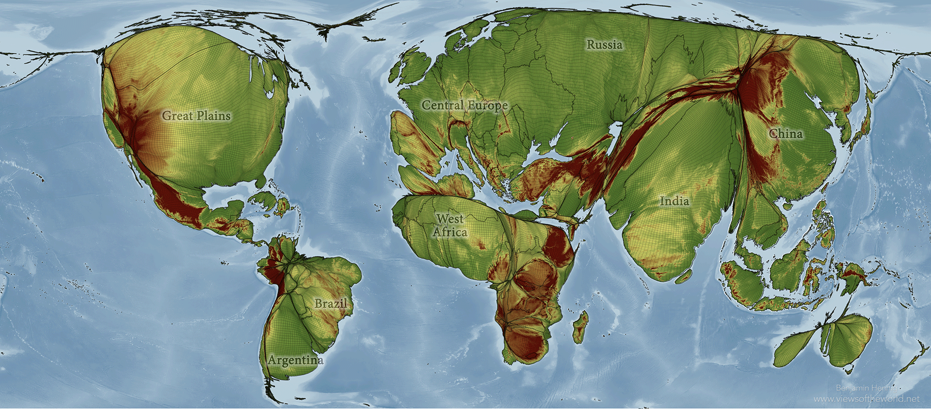
Our edible world
This is a map of where we grow our food in the world. It shows the planet drawn with the area of a plot of land sized in proportion to the amount of food crops produced there. It is in the world’s major croplands — the US Midwest, the Eurasian plains, the Deccan plateau in India and the Northern plains of China — that much of the world’s nutrition is produced in the form of wheat, maize and rice, the main food sources for humans today. With two to three more billion mouths to feed in the next few decades, maintaining the ecological stability of the soil and climate in these biologically productive areas is essential. Where these spaces are at risk, the potential for conflict rises.
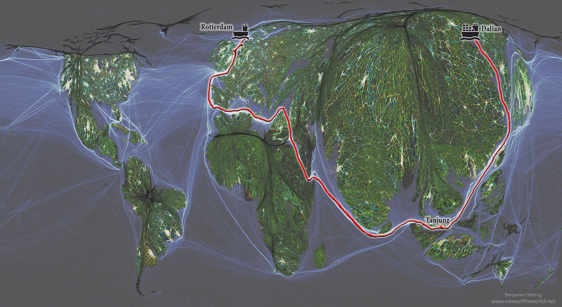
The lines that connect us
This map of the world has been resized to represent where people live, so China and India — with their populations of 1.382 billion and 1.326 billion, respectively — dominate. As a result, the deserts and the polar north almost disappear. This map also shows how our world is densely connected. The colored lines on the map indicate flight lanes, roads, railway lines, shipping routes, pipelines, transmission lines and underwater cables — the various routes that carry most of the trade driving the global economy. The route of the first voyage of MSC Oscar, the world’s largest container ship, from Dalian, China, to Rotterdam, Netherlands, past Singapore and through the Suez Canal, is shown in red. This ship transported so many containers of goods that when they were unloaded onto lorries, the convoy, if they’d all left at once, would have been 100 kilometers long. This huge quantity of stuff was moved around the world in one ship on one 36-day voyage in 2015.
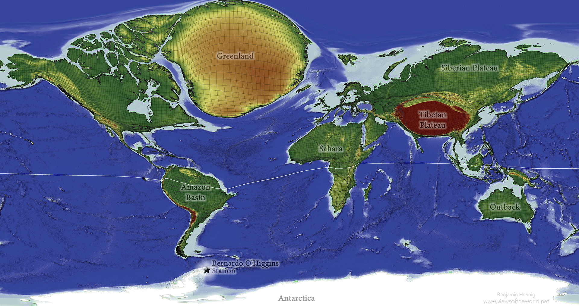
The best places to get away from everyone
We worry about how many people there are on the planet — and about how we can get away from other people. This map of the world is changed to enlarge areas depending on how far away they are from people; the more distant, the larger the area. So if you want to know where to go to get away from everybody, Greenland and Antarctica are probably your best options. Every year, these areas will get bigger, because every year, people are coming off the land globally, moving into the cities and packing in more and more densely.
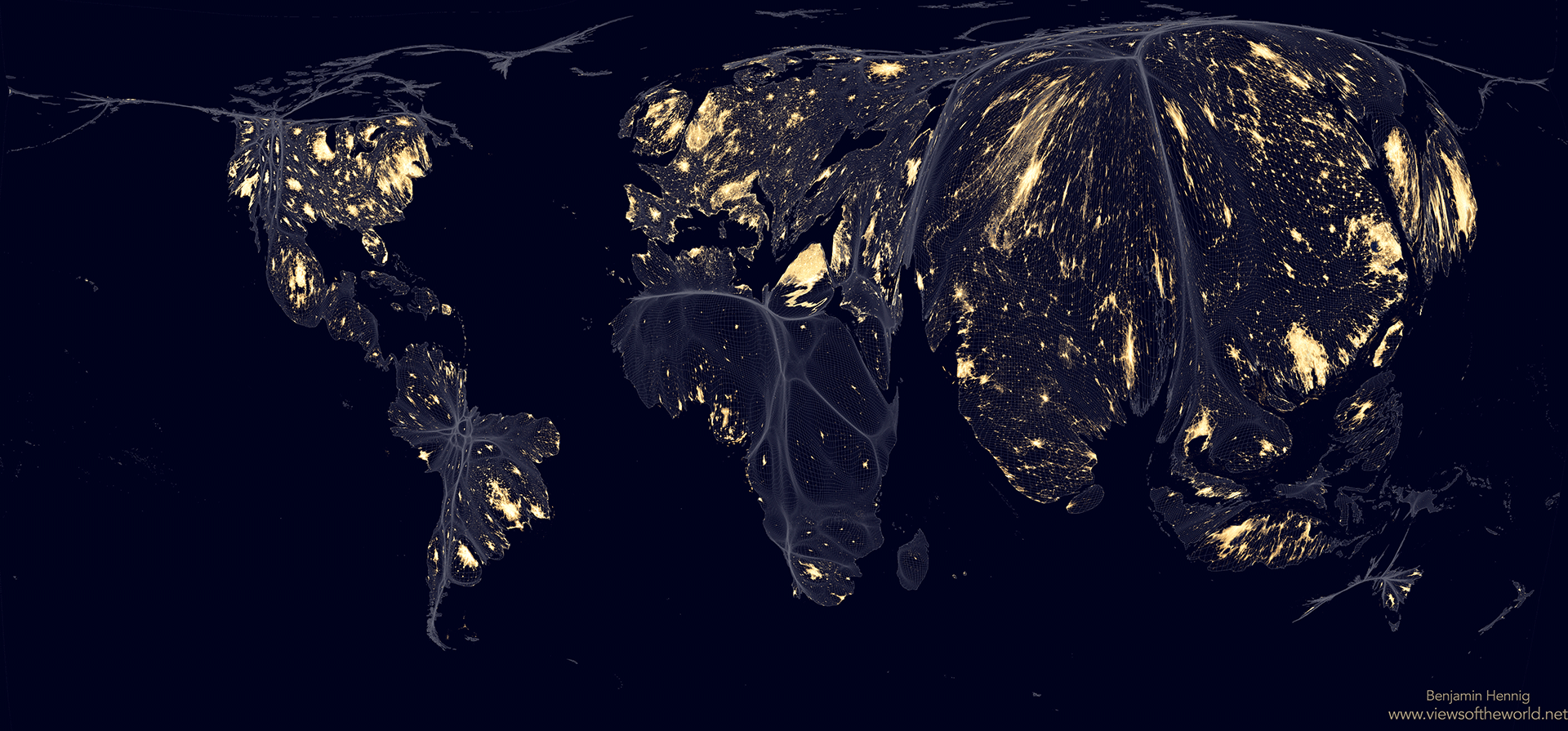
Our Earth at night
This map is produced by combining satellite images to create an image of what the Earth would look like if night occurred simultaneously all over the world. On this image, we’ve stretched the map to reflect where people live. If an area doesn’t have people, it was shrunk away to make it disappear. The lights on the map — in London, for example, or in Cairo or on the Eastern seaboard of the US — show you where people live who are so profligate with energy that they can afford to spend money powering lights to shine up into the sky, so satellites can draw an image like this. The dark areas are either areas where people do not have access to that much energy, or where people do but they have learned to stop shining their lights up into the sky. If I could show you this map animated over time, you’d see that Tokyo has actually become darker, because ever since the tsunami in Japan, Japan has had to rely on one-quarter less electricity because it turned off its nuclear power stations. Overall, this map of the Earth at night is an image of an unequal world. The wealthier parts are brighter, whereas large parts of the poor live in relative darkness.
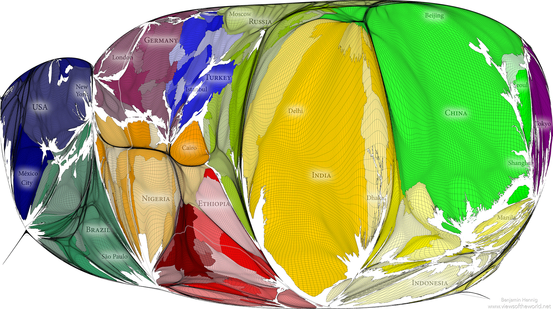
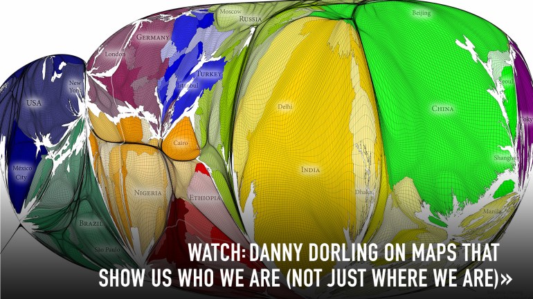
Our modern world
In the medieval European geographical tradition, many versions of the mappa mundi were produced — maps of the known world at a particular moment in time painted on cloth. In this modern version, the land area is proportional to human occupancy, and the oceans are almost eliminated. You are looking at about 7.4 billion people. India stands at the middle of this world for now, but the global population center is gradually shifting from there toward a more rapidly growing African continent. This pushes the significance of Europe and the Americas to the edges of the planet.