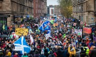

Here come the acronyms: In March, the United Nations’ (UN) Intergovernmental Panel on Climate Change (IPCC) published a working draft of its Fifth Assessment Report (AR5) from Working Group II (WGII), on “Impacts, Adaptation and Vulnerability” in the world’s climate. The 2590-page report was studded with dense charts containing … a lot of information. And did we say dense? We mean impenetrable. Frankly, they boggled our minds. Yes, government reports and scientific papers aren’t designed for laypeople — but do they have to be incomprehensible? We asked some of the IPCC’s 310 scientist authors to help make their graphics meaningful for the people who are affected by climate change. You know — everyone.
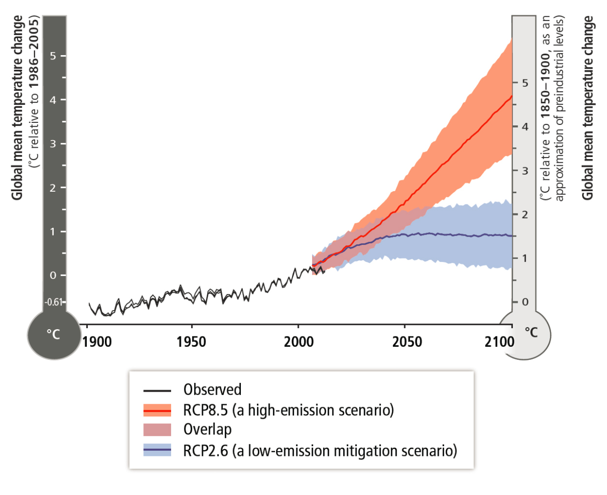
What you see: The temperature of the world is going to rise at an alarmingly red rate. Or maybe the temperature will still rise but at a slower rate, and the mercury in the world’s thermometer will get … blue?
What it means: This graph shows the projected rise in temperature through 2100, compared to the rise in temperature we’ve already experienced since 1900. (The “thermometer” on the right shows warming since the late 1800s. On average, temperatures have risen less than one degree since then.) The highest projections of greenhouse gas emissions, known as “Representative Concentration Pathways 8.5” (RCP8.5), are shown in red; temperatures could rise a full four degrees Celsius above recent temperatures. But if we’re aggressive about mitigating the effect of climate change, we could wind up in a low-emission RCP2.6 situation of a one- to two-degree temperature rise, shown in blue.
What the scientists say: We can help lower emissions, but as Michael Mastrandrea, assistant consulting professor at Stanford’s Woods Institute for the Environment, tells us, “Because of the emissions to date and the fact that we can’t just turn off our emissions tomorrow, there’s a certain amount of inertia in the system.” That’s why the red and blue lines take 20 or 30 years to separate. Says Mastrandrea, “We have an option between a world where the temperature continues to go up and a world where the temperature basically levels off or perhaps even comes down. That’s the choice we have now.”
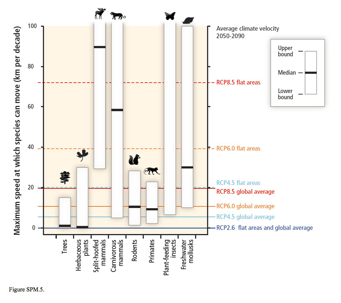
What you see: Trees can move between zero and 15 kilometers per decade, but snails can move up to 100 kilometers per decade. What the what?
What it means: As temperatures rise, species will have to migrate, generally toward the poles, to maintain life in the climate they’re used to. How fast they will have to move (to keep up with how fast temperatures rise) is called “climate velocity.” Based on both modeling and observations, this graph charts the maximum speed that different species can move against how fast they must move, shown on the right. The red, orange and blue lines are based on different estimates of how fast the temperature will rise, based on the possible greenhouse gas emissions levels discussed in the graphic above. Climate velocity is also divided between flat areas and the “global average.” That’s because as you increase altitude, temperatures decrease more quickly, but in flat places species will need to move farther and therefore faster to reach the climate they prefer.
What the scientists say: Mastrandrea points out that there’s a lot of diversity even within the species groups listed. Many species fall below the line of the worst-case scenario (the dotted red line marked “RCP8.5 flat areas”), which means they have no chance of survival. Only some species of split-hoofed mammals, carnivorous mammals, plant-feeding insects and freshwater mollusks even stand a chance.
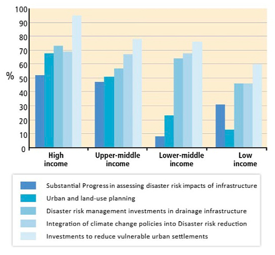
What you see: High income … something … is making more progress in disaster risk reduction than the low-income version of whatever that thing is.
What it means: This graph is based on data from 82 countries reporting progress in disaster risk reduction. The countries are broken up by income, and the y-axis shows the percentage of countries within each income bracket that have reported progress in these areas: assessing disaster risk impacts of infrastructure; urban and land-use planning; disaster risk management investments in drainage infrastructure; integration of climate change policies into disaster risk reduction; and investments to reduce vulnerable urban settlements.
What the scientists say: International Institute for Environment and Development senior fellow David Satterthwaite points out that low-income and low-middle-income countries are not paying attention to urban and land use planning, and disproportionately few lower-middle-income countries are assessing disaster risks. In these cases, local governments need to step in. Only one problem, says Satterthwaite: “Typically, even large cities have a very weak local government, very little revenue, very little investment capacity, huge deficits in basic infrastructure and 30 to 40 percent of their population living in informal settlement without piped water, sewers, drains, health care or emergency services.” Though he is somewhat optimistic that cities will indeed take small steps toward adaptation, he’s more concerned about mitigation: “For a city desperately trying to extend piped water to its population, improve the sanitation and the drainage and the health care, and taking disaster risk into account and climate change adaptation into account, the final agenda — mitigation — is very difficult.”
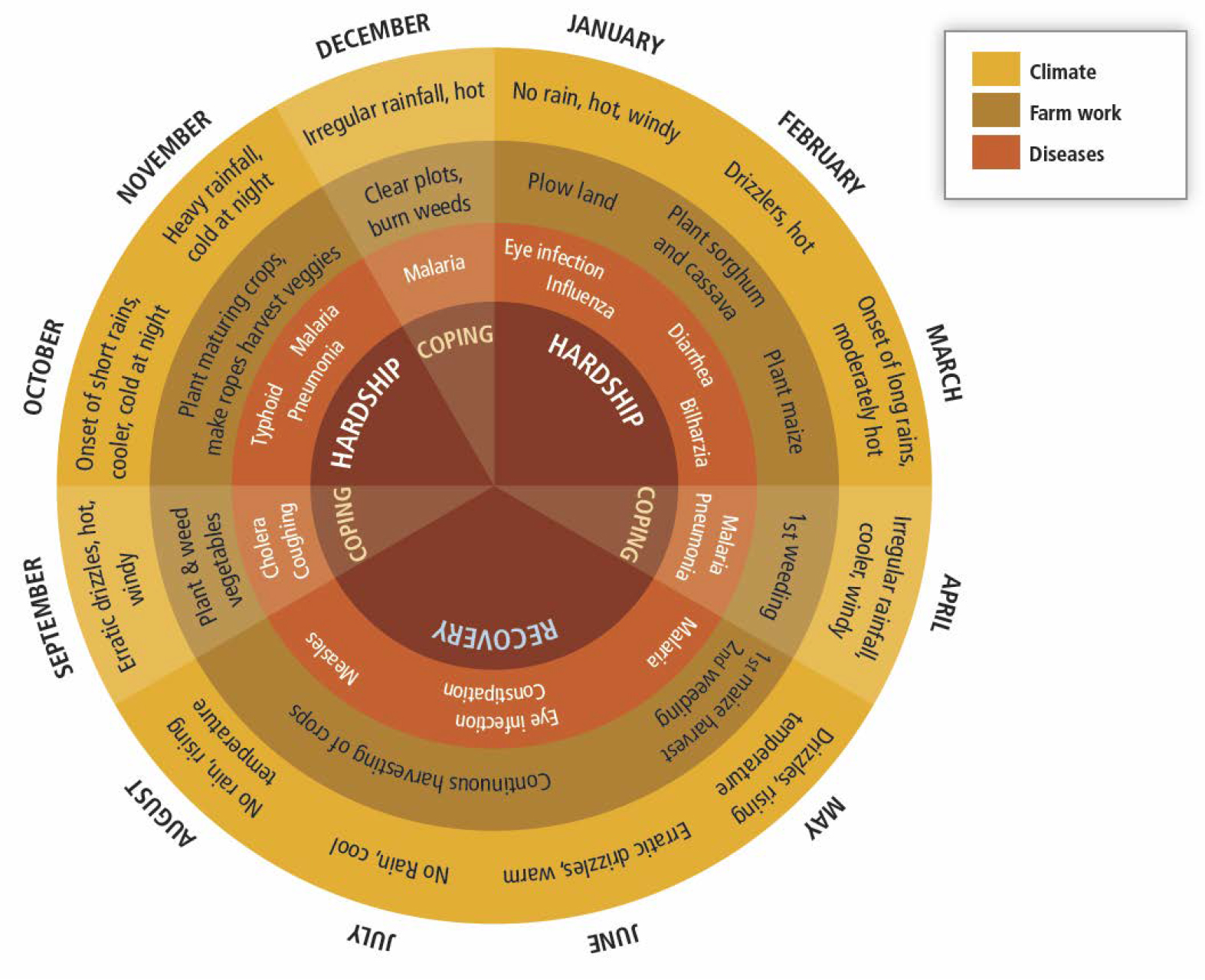
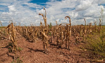
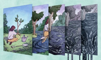
What you see: For smallholder farmers in the Lake Victoria Basin in Kenya and Tanzania, life is an endless cycle of hardship.
What it means: Climate change adds a level of stress to an already difficult lifestyle for smallholder farmers in this region. Traditionally, farmers go hungry during planting season, right when they need to do their most physical work. That period of hardship lasts from January to March. Recovery starts when the harvest comes in May, but then there’s a second hardship period during the shorter rainy season come October. At least, that’s been the annual pattern up to now. Climate change makes that rainy season unpredictable, lengthening the hardship period and delaying the harvest. And, of course, climate change can also prompt either droughts or floods, severely messing with the harvest and making life even more difficult.
What the scientists say: Penn State University associate professor Petra Tschakert says she wanted to “convey that the lives of poor people and the lives of marginalized populations are not static.” In fact, she points out, many people’s “lives and health and happiness fluctuate tremendously throughout the year depending on the rainfall and depending on when they grow and harvest their crops.”
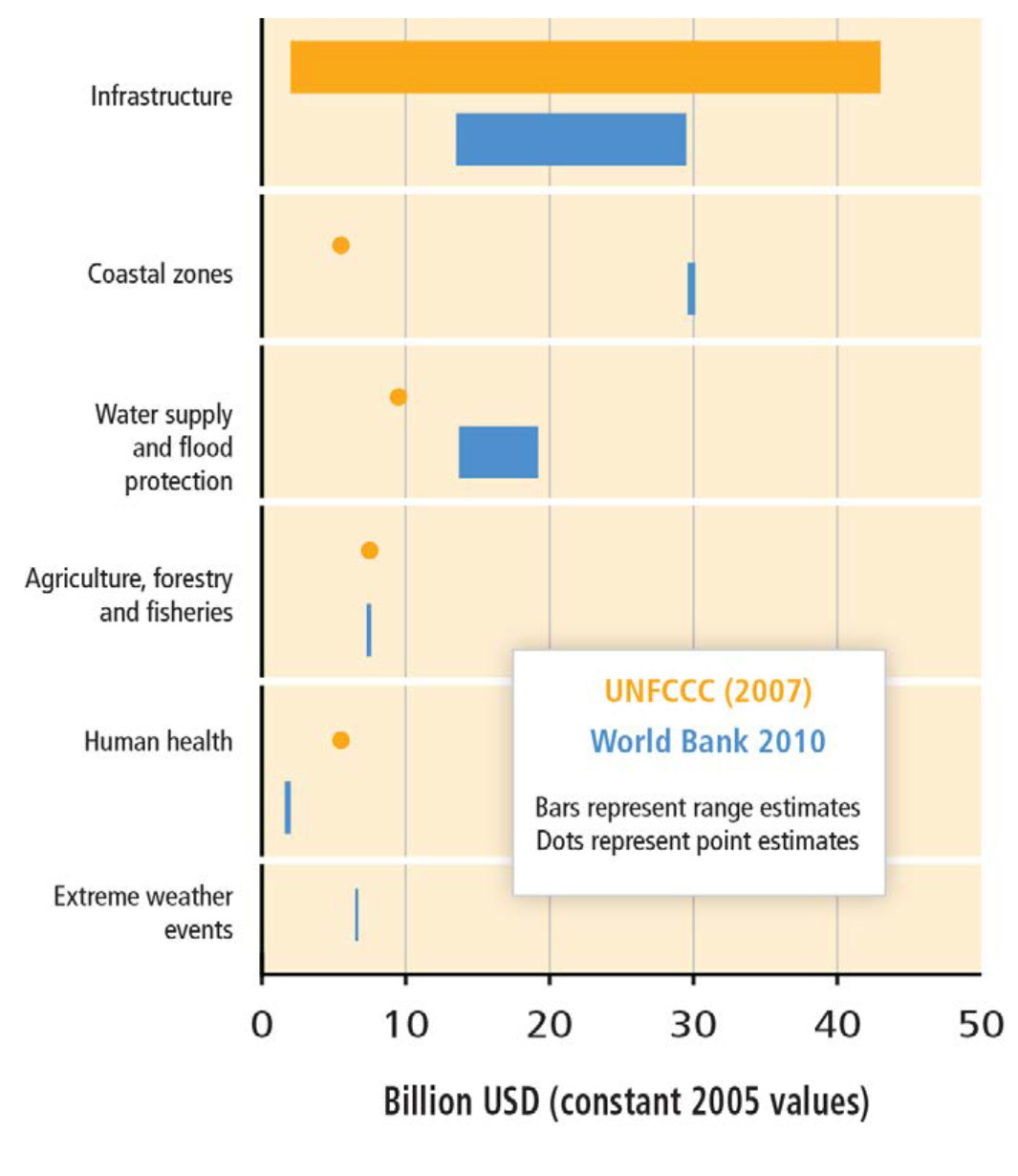
What you see: Infrastructure is really expensive. Adapting to climate change in developing countries is going to cost a boatload of money.
What it means: What this graph actually seeks to show is how difficult it is to predict how much adapting to climate change will cost. It compares two reports, one from the World Bank and one from the United Nations Framework Convention on Climate Change (UNFCCC), both of which estimate how much adaptation will cost in developing countries — with pretty different results. For example, the World Bank predicts that shoring up coastal zones will cost $30 billion, while the UNFCCC predicts a $5 billion price tag (both based on the 2005 US dollar).
What the scientists say: Reinhard Mechler, deputy director at the International Institute for Applied Systems Analysis in Laxenburg, Austria, says that because climate hazards tend to be region-specific, wide-sweeping numbers may actually be fairly useless. Originally, he says, they had tried to include an estimate for the total cost of adaptation for developing countries in the summary for policymakers — but the range was absurd: anywhere between $4 billion and $109 billion.
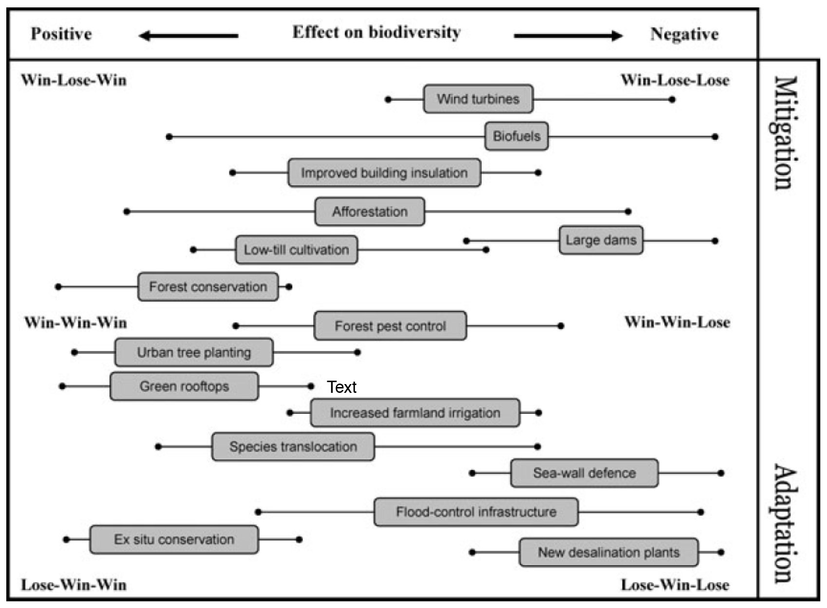
What you see: Different climate-change-fighting actions can be positive, negative, adaptation, mitigation, losing, winning, or, um, all of the above?
What it means: This figure is about the trade-off between major mitigation and adaptation strategies in terms of the impacts on biodiversity. Each gray box is a common action that can be taken to combat the effects of climate change, charted according to data taken from a synthesis of a review of all the literature published on each one. Each action is plotted on a scale from “very beneficial to mitigation” (top) to “very beneficial to adaptation” (bottom) and a scale from very good for biodiversity (left) and very bad for biodiversity (right). The gray box is drawn according to where the action can confidently be placed with respect to biodiversity, while the lines to either side represent the entire range of where it might fall. Win/lose-win/lose-win/lose combinations correspond to benefits for adaptation, benefits for mitigation and positive effects on biodiversity, respectively. (Wind turbines, for example, are very important for mitigation, but aren’t helpful at all to adaption, and are between neutral and negative for biodiversity.) According to the analysis, the most beneficial actions are forest conservation, urban tree planting and green rooftops, while sea-wall defense, desalination and building dams (big, infrastructural projects) are the least beneficial.
What the scientists say: Mark Rounsevell, professor of rural economy and sustainability within the school of geosciences at the University of Edinburgh, says that even though the figures are based on literature review, the chart is still somewhat subjective, since the point is to place the actions in relation to each other, not to assign each one a number value.
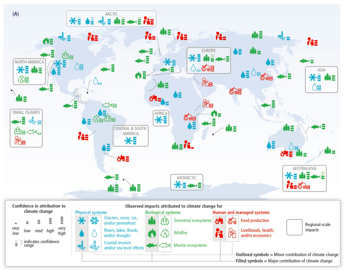
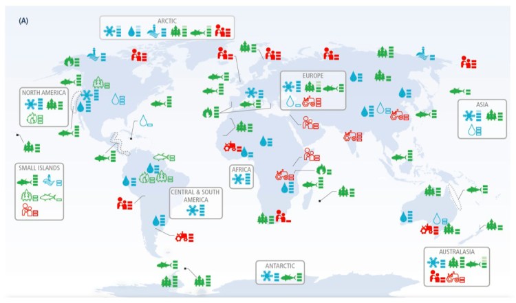
What you see: A thrillingly dense map showing that glaciers, snow, ice and/or permafrost are being affected in central and south America, Africa and Asia — but livelihoods and health are not.
What it means: This map is meant to show the variety of impacts from climate change in different regions of the world. A filled-in icon shows that the impact from climate change to that particular system is major; an outlined icon shows that it is minor. The little meter next to each icon is a qualitative measure of how confident the authors are that the impact is actually due to climate change. The icons in the continent-wide boxes indicate systems affected across the entire region, not just locally.
What the scientists say: No place in the world will escape the impact of climate change. But we still don’t really know what we know — or have a good system for gathering salient data. Says the chief scientist for global change at the United States Geological Study, Virginia Burkett, “one of the more alarming things to me is that the number of scientists publishing about climate change in South America, Africa and Central America is less than five percent of the global total. Those developing countries in many cases are going to be disproportionately affected by climate change, either due to lack of adaptive capacity or severe impacts such as drought.” That’s why even though you’d think livelihoods and health would be affected by climate change everywhere in the world, there is actually too little literature and too many contributing factors to scientifically prove a link to climate change in every case.