Architect Ole Scheeren fights against the rigid hierarchy of the skyscraper.
When Ole Scheeren (TED Talk: Why great architecture should tell a story) unveiled his design for a complex of residential towers in Singapore, his clients were stunned. “There was a moment of silence, and I could feel that there was a degree of disbelief in the room.” Why? Because Scheeren had turned 12 towers on their sides, and stacked them like Lincoln Logs. It would take him two weeks to convince the clients that the plan could even work — but he relishes conversations in which he can challenge the ingrained notion that the only way is up. He invites us to reimagine our cities’ skylines via two of his iconic buildings.
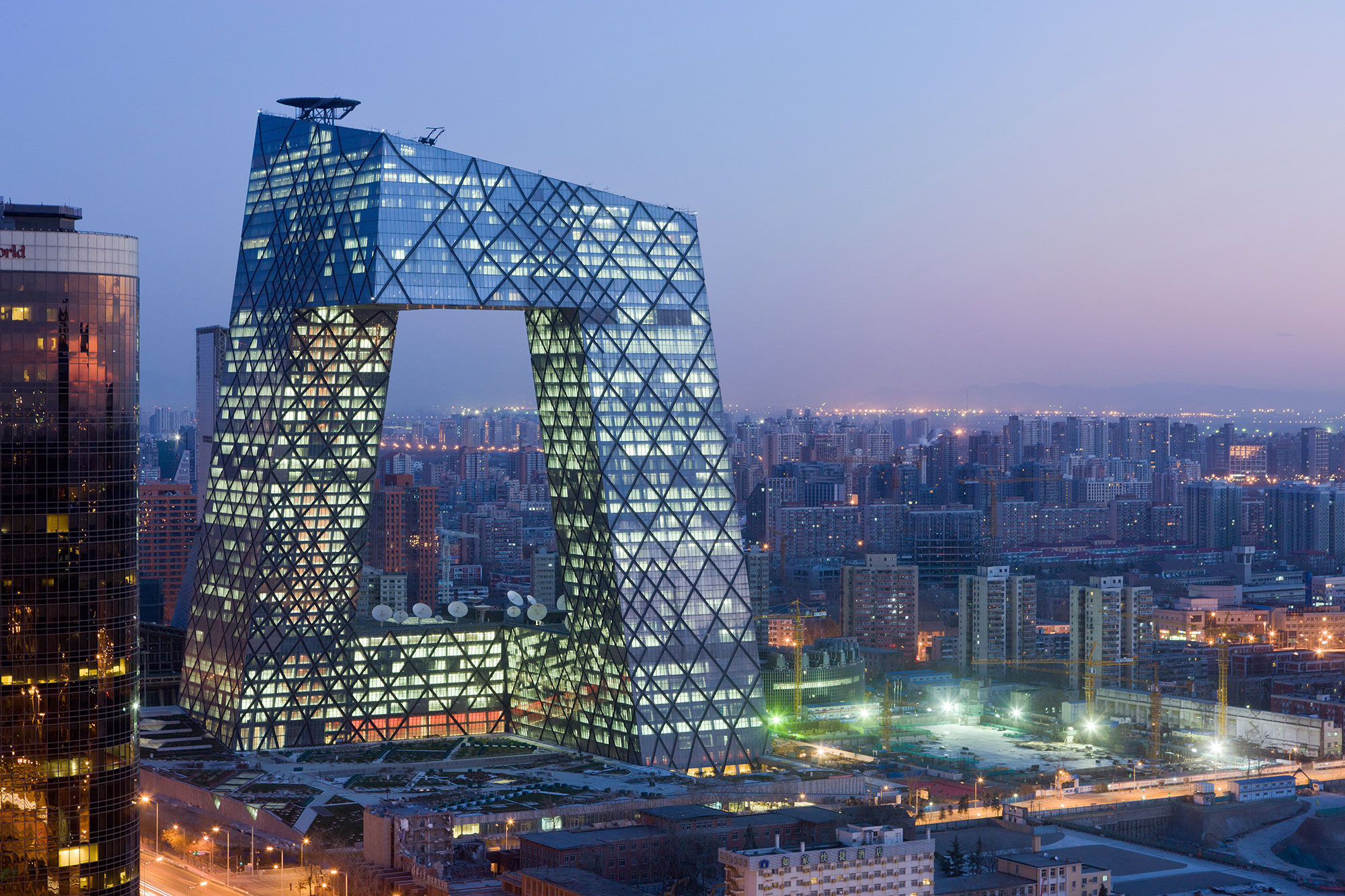
The steel loop of Beijing’s CCTV building
Scheeren, then a partner at Dutch architecture firm OMA, designed the headquarters for one of China’s largest broadcasting companies. From the very beginning of the design process, he knew that he wanted to avoid a regular skyscraper design. “A tower is a very isolating structure for the people who occupy it, who are simply stacked floor by floor,” Scheeren says. “We took the needle of the tower and bent it back into itself to create a loop of interconnected activities, like a tube folded into space. It’s a system that has no beginning or end, that is not about the hierarchical top and bottom.”
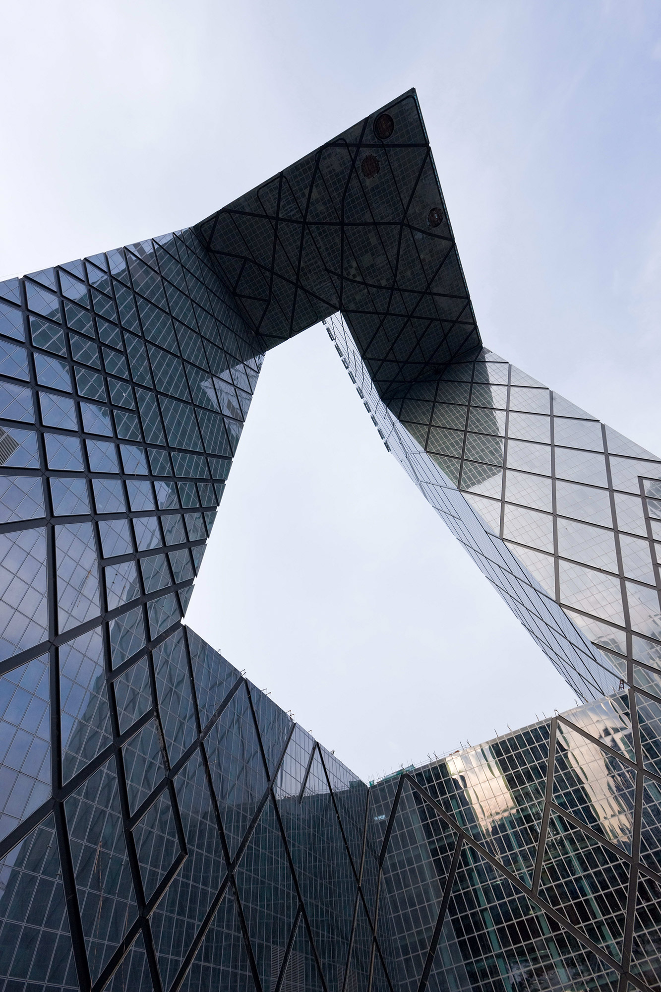
A profile in strength
“This is one of the strongest views of the CCTV, where you’re under the giant overhang,” says Scheeren. That overhang is 36 stories above the ground, and it contains 11 floors. It’s essentially a building the width of a soccer field that cantilevers out into space. Meanwhile, the hashmarks on the building’s facade expose the tower’s structural supports in a showcase of engineering prowess. “Probably five years earlier it would have been impossible to engineer this building because computer analysis was not advanced enough,” says Scheeren.
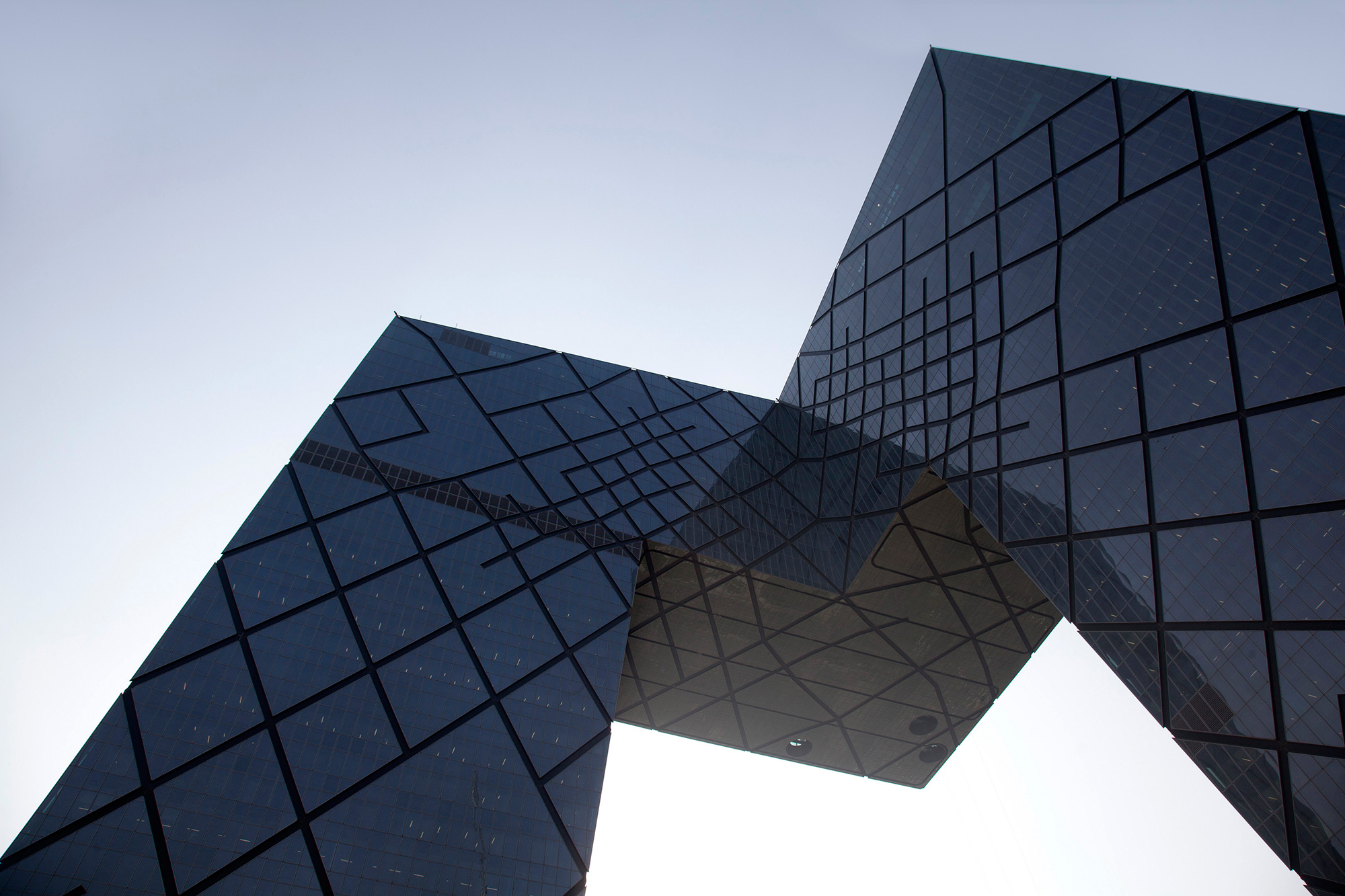
A profile in delicacy
Walk around the base of the tower, and its profile changes dramatically. “It can go from very strong and imposing to suddenly becoming unstable and almost fragile,” Scheeren says. “It suddenly becomes an almost unstable ‘Z’ shape that leans forward.” The idea is to lure visitors to gawk around the outside of the building, so that the building not only serves its occupants but becomes a public attraction in its own right. “I think it provides a whole different level of engagement of the public space of the city,” he says.
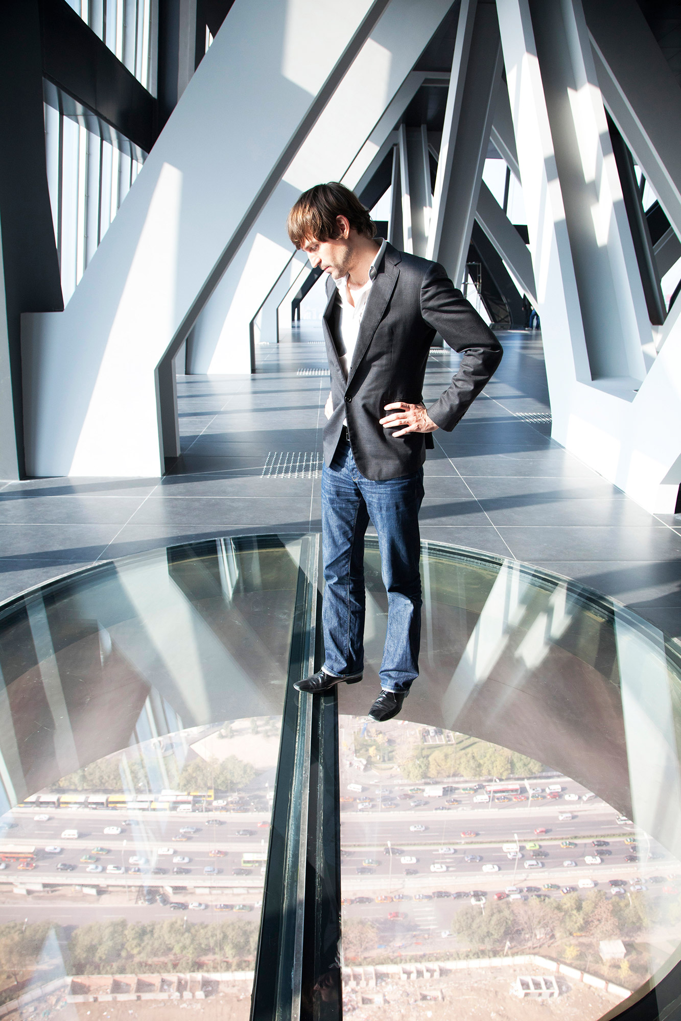
A portal to the city
The cantilevered section of the building starts on the 37th floor and includes an observation deck. There, sheets of glass have been embedded in the floor, affording an eye-watering view of one of Beijing’s largest highways. “You can stand on a piece of glass and watch the city pass by 160 meters below you in slow motion,” says Scheeren, above. For reference, that’s a straight drop roughly the length of three Olympic swimming pools.
A jumble of horizontal towers
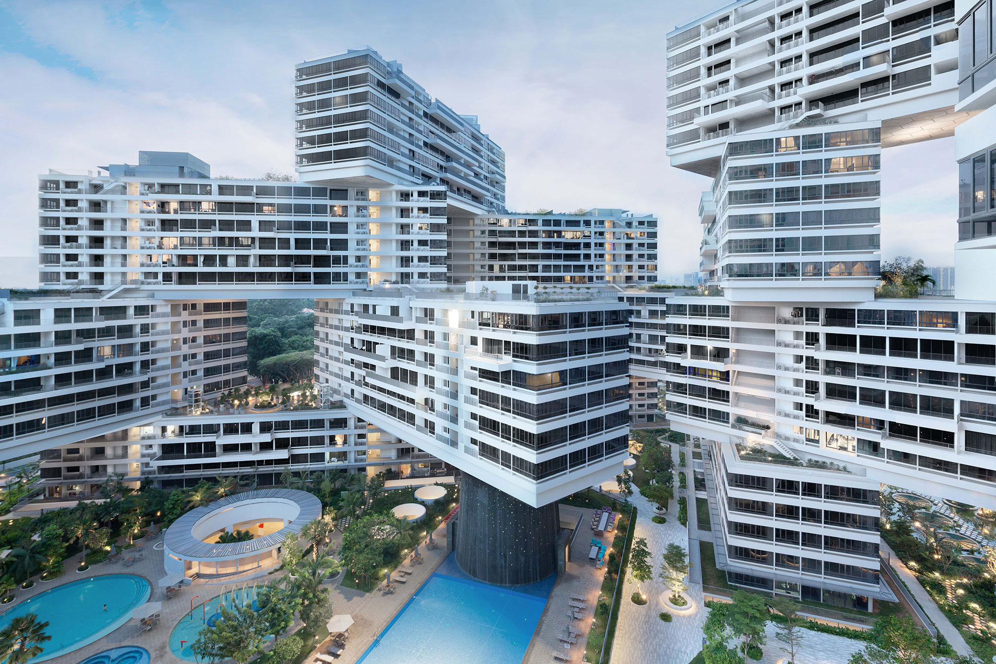
“The Interlace,” a complex of 1,040 apartments in Singapore completed in 2012, was another building Scheeren worked on whilst at OMA, and shows a clever answer to a building restriction that limited the height of the complex to 24 floors. To create a thousand apartment units would have meant building 12 towers. “I felt this little forest of towers in the middle of a huge jungle of green would be fairly absurd,” says Scheeren. Instead, he turned the towers sideways, creating an interlocking structure of buildings, plazas and gardens.
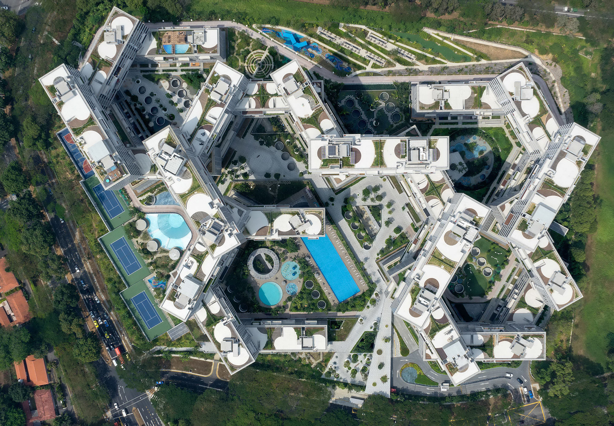
The view from above
“There is a very strong underlying logic to this stacking system,” says Scheeren, who describes the building as a “space generator.” The hexagonal structure opened up giant outdoor communal spaces between the apartment blocks, many including water gardens, performance spaces, even a theater.
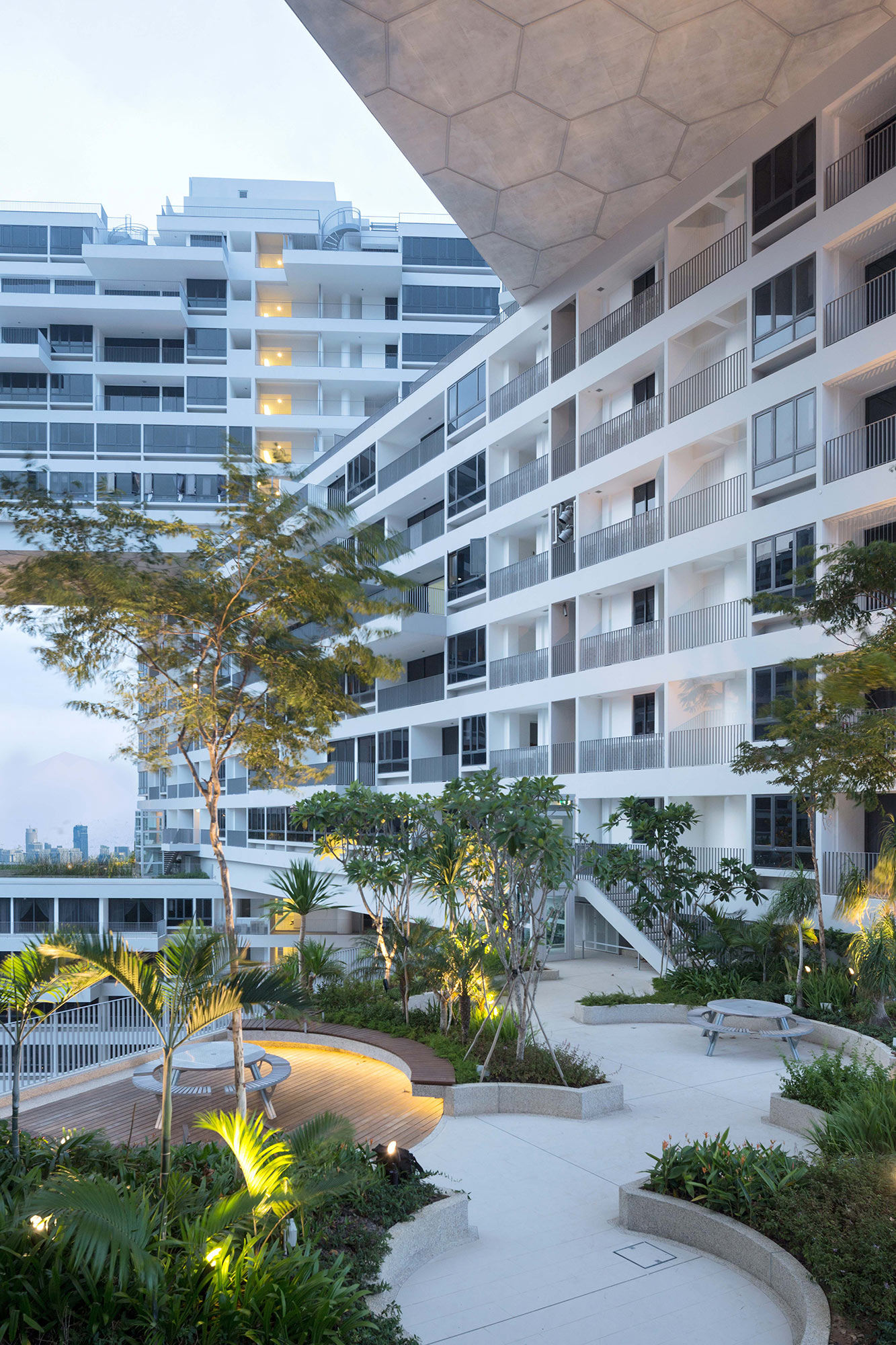
An expanse of green
No, not an entrance way, but actually a roof garden on the 13th floor of one of the blocks. Add up the total area of the gardens from the ground floor to the rooftops, and it actually constitutes a 12% expansion of the green space that had originally been available on the 20-acre plot of land. “Of course, that simply illustrates how we are maximizing the space, and in a way giving space back to the people for free,” says Scheeren.
Images courtesy of OMA / Iwan Baan.

