A well-designed flag can be a thing of beauty, inspiring pledges of allegiance galore. But weirdly, bad flags can inspire passion and loyalty too, suggesting that democracy and design don’t always work together hand-in-hand.
In 1926, the Union of South Africa needed a flag — badly.
 Formed in 1910 by the joining of four former colonies, South Africa had been flying various red and blue ensigns — flags with close connections to British imperialism — but their use provoked outrage from some quarters. Finally, in 1925 a bill was introduced to Parliament to change it, and controversy immediately erupted over what it should be. Under pressure from several heated factions, the steering committee elected to compromise: a flag of horizontal orange, white and blue stripes with — bizarrely — three other little flags centered in the white stripe. Yes, there were tiny flags within the flag, a confusing image that brings to mind the famous adage that a camel is a horse designed by a committee. Nonetheless, this remained the official flag until 1994, when the first universal elections were held, apartheid was ended and a new regime took over the government — and a new, well-designed flag was flown.
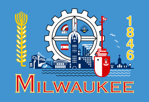
 Stories like this are more common than you think — plenty without the happy ending. Obscured behind the well-designed flags we know and love are a wealth of ugly ones from cities, states and countries alike: San Francisco, Sydney, Turkmenistan, Tunisia, Pocatello and Libya, to name but a few. There’s no one clear reason why we’ve ended up with so many bad flags — history, democracy, psychology, bureaucracy and just plain ineptitude all play a role — but there’s a growing awareness that some flags are ready for the rubbish heap. Many cities around the country are currently taking action against bad design, including Milwaukee (whose cluttered, too-many-cooks flag came in 147th out of 150 on a 2004 ranking of city flags).
But strangely, today’s redesign process demonstrates that even ugly flags are hard to change, a situation governed more by human fears of change than by any aspect of the design. As objects, flags are more strictly symbolic than most things in the human repertoire, and historical and social conventions have imbued them with surprisingly deep meanings. That connection can inspire great allegiance — but when the flag is a turkey, that allegiance creates a problem. Here, vexillologist Ted Kaye, veteran of many flag redesign campaigns, shares why flag redesign can be so complicated — and how flag design provides a kind of roadmap toward better ways to approach design well.
Americans expect to have their voice heard — even if it flatly hampers the design process.
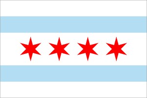 Flags were intense from the get-go. We think of them most often as symbols of countries, but any Game of Thrones fans will tell you that they were born on the battlefield. Social conventions developed to protect and honor them; the role of flag-bearer became an honored one. Over time, flags developed into symbols of kingdoms and countries, and their emotional legacy intensified. Today, they can inspire more loyalty and love of country than the country itself — a soft spot that today’s sports teams and product-branding professionals zero in on as well. Although they’re physically nothing but a few sewn strips of fabric, great flags can help unify people. “Great symbolism helps a group be a better group,” says Kaye, reflecting on how in places like Chicago, the flag has become a measurable part of the city’s lore and legend. When a flag is loved, it gets printed on everything: T-shirts, coffee cups, stickers, and even ourselves. So flags can not only embody a place, they can help create it.
Design and democracy don’t mix easily. The strong feelings that even ugly flags can inspire aren’t particularly helpful to the design process. So unless politicians have a clear majority mandate for flag change, they are going to avoid riling up allegiances. “Politicians dare not poke a hornet’s nest, even if only a few people care at all,” says Kaye, adding that politicians can themselves be the ones overreacting emotionally. Kaye describes a common scenario where, in places where the ugly flag waves, politicians get presented with new flag designs by well-meaning designers. Their answer? They often get angry and defensive, fueling loyalty to the current flag. Without them, change is doomed.
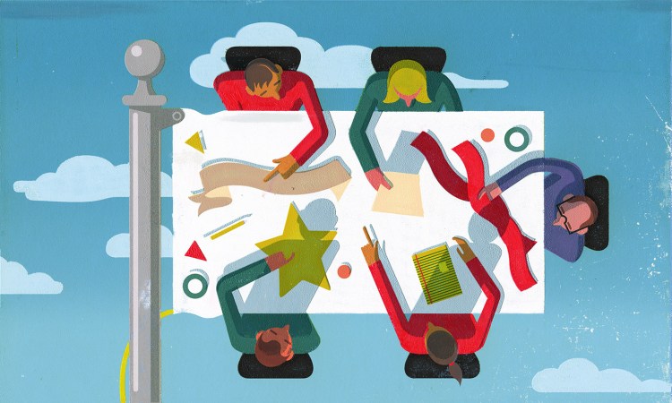
Even if a redesign gets off the ground, the challenges posed by the democratic ethic can bollix it up. For one, flag design is often left in the hands of a committee, a fate feared by designers everywhere. With a focus on consensus and compromise over design, committees can end up hideously distorting a design project — especially since committees often lack understanding of basic design principles and make choices that flout them. When the graphic designer responsible for designing the Portland, Oregon, flag handed in his design, the city council slapped on the city seal over his design; it took more than thirty years to convince them to remove it. Similarly, in Arkansas, the committee requested that the winning design be rearranged so “ARKANSAS” could be emblazoned across it. Both were flat-out bad ideas violating one of Kaye’s principles at the heart of good flag design: no lettering or seals.

Good flags need gatekeepers. This doesn’t make “democratic design” a oxymoron. The public can be included in the design process as long as the complexities of handling their opinions are negotiated expertly. Americans expect to have their voice heard — even if it flatly hampers the design process. “We have democratic traditions that hold that no central authority should tell us what we should do about our symbolism. That’s our democratic ethos in the US. That’s not true in a lot of other countries,” says Kaye. In the Czech Republic, for instance, a government ministry approves city flag designs. “So all the Czech municipal flags are all great designs, because there’s been this expert mediation in their adoption.”
In Great Britain, mediation takes the form of a private group, the Flag Institute, that established the UK flag registry; the group exerts pressure on the design process by refusing to register a flag unless it’s a good design. Having many of the same democratic leanings as the US, Canada leaves it up to cities to decide whether or not they want expert mediation. If they choose, cities can decide on their flag themselves, but they also have the option of going to the Canadian Heraldic Authority, a board of flag design experts. This hybrid system leaves Canada with a mix when it comes to city flags: some are great, some are terrible.
Watch out for nostalgia. People trying to redesign a flag have many times been caught off guard by the loyalty and devotion people hold for the old flag, no matter how ugly, outdated or irrelevant. For example, in May 2015, New Zealand launched a redesign effort for its national flag. After the Flag Reconsideration Panel narrowed down all 10,292 submissions, New Zealanders voted on the possible replacements. Voters chose between the preferred replacement and the current flag, which had been in use for 146 years. Having been in New Zealand for the debate, Kaye says he noticed a marked generational difference in voters. “If you’re above a certain age, certainly if you had any connection to the second World War in New Zealand, you’re much more likely to favor keeping the flag. Again, it’s the ‘I fought under it, my colleagues died under it, my father served under it’ that lead people to keep it.” None of those were design-related arguments, just emotion-related. In the end, after months of efforts and thousands of submissions, New Zealanders chose to keep their old flag.
A good judge knows when to overrule. One way to manage the role of loyalty and familiarity in design is to simply ignore it. “At the national level, flag change often happens over the objection of the majority,” says Kaye. Take Canada: in 1964, when the Prime Minister proposed a new national flag, the flag was a unremarkable British red ensign with Canada’s coat of arms added for good measure — it looked like 100 other flags. It had absolutely none of the design beauty of the iconic maple leaf. Regardless of the superior design, the proposed flag change became known as the Great Canadian Flag Debate because of how fiercely it divided people. “The Parliament and the Prime Minister pushed through the Maple Leaf flag despite the strong feelings of a majority of the population,” Kaye said. The result was a great flag that quickly became loved by Canadians. “Canadians look at that flag now and think “That is a great flag, a wonderful symbol of our country — I can’t imagine preferring that to our old flag.’ That’s today, 50 years later, but if it had been put to a vote, the polling showed that people would have preferred the old flag.”

Make emotion your ally. It’s possible to use the extreme emotions flags elicit to lead people toward change. Kaye cites the case of Georgia’s state flag, which in 2000 was under fire for still containing the Confederate flag. In 2001, a plug-ugly flag was pushed in, featuring many small versions of many of Georgia’s previous flags, and was promptly ranked by a survey as the worst state flag in the country. So in 2003, a new and attractive one was ushered in. Pride had bested tradition. As Kaye says, “It’s possible to use more positive emotions like pride to overcome people’s attachments to tradition.”
Should we bolster flagging spirits? Maybe, if emotion plays such a powerful role in design, we can set up design processes in ways that helps us navigate them. Rather than overriding them or having the process completely derailed by them, we can try to understand and acknowledge what’s behind stakeholders’ reactions — and work with them instead of against them. Architectural designer Christopher K. Travis practices what he calls “emotional architecture.” With the help of a neuropsychologist and a psychologist, he has created an intensive process to help him understand the personality of his clients. He has tried to distill this approach into a software tool called Truehome, with the goal not only of tuning into what people really want versus what they think they want, but to avoid the arguments and emotional reactions that are all too common around design.
Good design is important, and good flags help give our communities a spirit and identity we are glad to share in. Bad flags are like bad design: a drain on the system, a waste of time, energy and resources that inspire little positivity or community spirit. There’s no perfect recipe for democratizing the design process, but acknowledging the crucial role that emotion plays in it is not a bad place to start — as long as you’re prepared for what comes next.


