There’s no Academy Award for Best Color — yet — but this less-celebrated element of filmmaking is used to propel and convey the plot. Here’s how.
A sunny, hopeful yellow. An introspective turquoise. An arresting, violent red. When you see a color in a film, what you see is no accident — filmmakers carefully compose each frame and make color decisions that affect your experience of watching, even if you don’t realize it. Here are the ways in which filmmakers use color to deepen narrative.
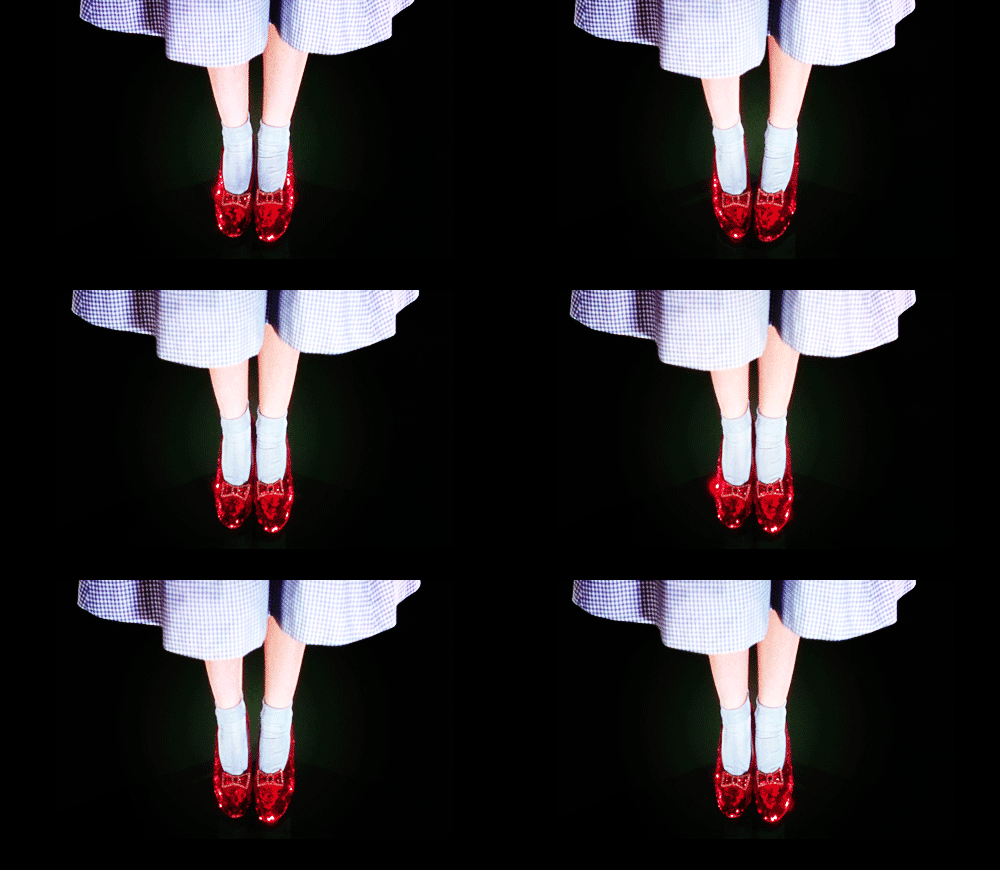
Color simplifies complex stories. We think of early films as black-and-white, but color has been around since the start — it lent authenticity to the travelogues of the 1890s and made works like Georges Méliès’ A Trip to the Moon (1902) feel fantastical. Barbara Flueckiger, film professor at the University of Zurich, has created a timeline of the 230+ processes used to color films over time, and by some estimates, up to 80 percent of early films featured color. Filmmakers realized that different tones could help viewers follow stories that jumped between characters and locations. In Intolerance (1916), for example, D.W. Griffith gave each of his four storylines a unique tint to signal they took place in different time periods. To achieve color, early filmmakers immersed film strips in dyes and chemicals, or had them painted by hand — a labor-intensive process done mainly by women in sweatshops. Sound is what ended color’s onscreen reign, because connecting a soundtrack to a film strip with applied color was difficult. Color didn’t return until 1932, when Technicolor created a process which transferred dye onto film. With prestige productions like The Wizard of Oz (1939) and Gone with the Wind (1939), Technicolor developed many of the color techniques still used today, even as film has gone digital.

Color makes the audience feel. Danielle Feinberg, director of photography at Pixar, describes herself as “color obsessed” (TED Talk: The magic ingredient that brings Pixar films to life). “I think about it nonstop,” she said. “Lighting and color are part of the backbone of emotion.” She points to the scene in The Incredibles (2004) where Mr. Incredible works at his desk at Insuracare — the colors are dulled and gray to communicate a sense of depression. In Toy Story 3 (2010), a yellowish-green around the character Lots-o’-Huggin’ Bear foreshadows that maybe this isn’t the sweet, lovable bear you thought. For each film, Pixar creates a “color script” that maps out the hues for all scenes so they fit within the larger story arc. The goal: to make key moments feel appropriately vibrant or somber. Feinberg looks at the opening of WALL-E (2008): “We had to do massive visual storytelling because there’s no dialogue — only robot boops and beeps. Yet, we needed the audience to understand that we’re on Earth, that it’s polluted, and that WALL-E’s the last one left. So we limited the palette to tans and oranges,” she said. “Our production designer was adamant that there be no green anywhere, because he wanted a visual punch when WALL-E finds a plant for the first time.” Color amplifies this important moment. “Your eyes have been washed in a limited palette and suddenly there’s intense green,” said Feinberg. “It cerebrally makes a difference.”
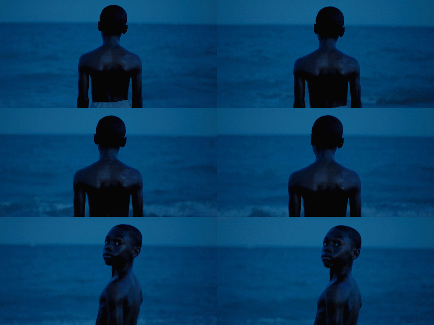
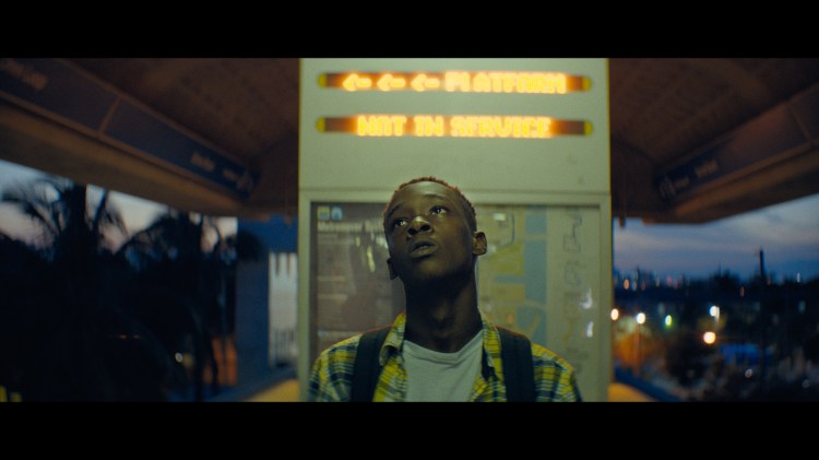
Color shows a character’s journey. In this year’s Best Picture Oscar winner, Moonlight, director Barry Jenkins tells the story of a boy named Chiron growing up in a rough neighborhood and wrestling with his identity amid the crack epidemic and extreme bullying. While sharing this difficult story, Jenkins also wanted to capture the “magic of Miami,” the city where he grew up. Cinematographer James Laxton worked with Alex Bickel, colorist at Color Collective, to think about the color design of the film early in the process — and then they spent about 100 hours after filming fine-tuning the color grade digitally. “Miami is an inherently colorful place,” said Laxton. “We were able to saturate colors and bend hues to enhance things.” They also emulated the color characteristics of three different film stocks to show the evolution of the main character. Moonlight tells Chiron’s story in three parts: in part one, when he’s known as “Little,” they emulated Fujifilm stock, which brings out lush greens and blues; in part two, as he becomes the teenage “Chiron,” they emulated Agfa stock, which has cyan in its highlights and makes things seem a little off-kilter; in part three, when he transforms into the adult “Black,” they moved to Kodak Film stock, which gives a polished, Hollywood look.
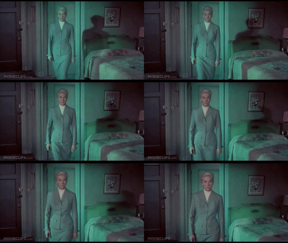
Color communicates a film’s ideas. Filmmaker Lewis Bond hosts a YouTube channel on film craft and he has made a poetic explainer on color in film. In it, he explores how colors reveal a film’s meaning, and he recommends watching movies for specific color repetitions. “When a color repeats, it’s associated with an idea,” he said. “When the color changes, it shows you this concept has changed.” In Alfred Hitchcock’s Vertigo (1958), green is associated with Madeleine and the main character’s obsession with her. The color becomes more and more prevalent, and eerie, right through the film’s conclusion. In Blue Is the Warmest Color (2013), blue is everywhere — and while the shades are bright and vivid at first, they become icy and pale. “It’s a visual externalization of tenderness fading,” said Bond. In Moonlight, cinematographer Laxton made a bold color choice that adds meaning — putting a bright, jarring hot pink in strategic scenes. We see it first in a heart-stopping sequence with Chiron’s mother. “We discovered that hue shooting the scene, and it just did a lot of things for us,” said Laxton. It feels both angry and sensual at the same time, but beyond that, the color signals moments when Chiron breaks from reality. The pink color repeats in a dream sequence, as Chiron faces his real desires — another key moment when his identity is forged. “It feels heightened,” said colorist Alex Bickel. “It takes you to a supernatural place.”
While color helps further a film’s story, all interviewed here agree: It must do so without calling too much attention to itself. “The last thing I want anyone to think while watching a movie is, ‘God, the color in this scene is great. Or, it’s terrible,’” said Bickel. “It works best on a subconscious level.”

