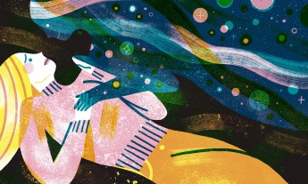
Bright, vivid color really does give us more energy — and that’s just one of the things designer Ingrid Fetell Lee discovered in her 10-year search for the sources of joy.
Few people would name their favorite color as gray or beige, yet our closets and our homes are often filled with these bland, neutral tones. When I studied color and its effect on joy, I wondered: Why is there such a gap between the colors that enliven us, and the colors that surround us?
“Chromophobia,” was the immediate answer I received when I posed this question to Peter Stamberg and Paul Aferiat, architects of the technicolor Saguaro Hotel in Palm Springs, California, which credits its electric hues with making it the third most Instagrammed hotel in the world.
Why are people scared of color? “It’s the fear of making a choice,” said an architect. “Of making a mistake and having to live with it.”
“People are afraid of color,” Stamberg told me. He was clearly referring to people other than himself and Aferiat, who live in a temple to vibrancy. Their open New York City loft was divided not with walls but with colors — panels of yellow, green, blue and orange. The two sat perched on a violet sofa, next to a pair of vermillion chairs, a pink rug underfoot.
“It’s the fear of making a choice,” Aferiat said. “Of making a mistake and having to live with it.”
I could relate. I used to be a certified chromophobe, so afraid of color that the entire spectrum of my apartment fell between white and cream. My sofa was ivory; my bookshelves off-white. My bed linens, towels and curtains were all crisp, clean white. In the corner of my bedroom I piled my clothes on a director’s chair covered with — you guessed it — white canvas. Whenever I needed a new piece of furniture, I browsed colorful catalogs, ogling mustard velvet sofas and pink-striped slipper chairs. But in the end, I always came home with trusty old white.
Then one day I moved into my dream apartment: a railroad layout on the top floor of a brownstone, with wood floors, windows overlooking a green yard and a small skylight. The only problem — the walls were a buttery yellow. From the moment I first saw the space, I fantasized about repainting it.
But something funny happened. Each day I’d come home to that apartment, it felt like the sun was shining, even in the dead of winter. When I returned from a trip, I felt overjoyed to be there — every single time. I ended up living there for six years, and after the first week I never again thought about repainting.
From the moment I began studying joy, it was clear that the liveliest places and things all had one thing in common: bright, vivid color.
Why are there so many chromophobes out there? I think it’s because there’s a cultural bias against color. We’ve come to dismiss color and joy as childish and frivolous, prizing neutral hues as a mark of coolness and mature taste. That belief has left us in a place where we feel almost ashamed to have color in our lives.
I’ve spent the last decade studying joy. From the beginning, it was clear that the liveliest places and things all had one thing in common: bright, vivid color. Whether it’s a row of houses painted in bold swathes of candy hues or a display of colored markers in a stationery shop, vibrant color sparks a feeling of delight.
The human eye is adept at distinguishing between subtly different colors. Scientists estimate we can see as many as seven million distinct shades. As it turns out, our color vision is an integral sense that relates directly to our survival. Our distant ancestors were nocturnal animals who had little use for color vision. They foraged under cover of darkness, relying more on smell than on sight. But some 25 million years ago, brazen night monkeys ventured out into the daylight, adopting the diurnal schedule that we still follow today.
The ability to see color suddenly became a useful advantage. While the eyes of their nocturnal cousins had two types of color-sensing cone cells, our ancestors evolved a third cone that was sensitive to light in the middle of the spectrum, radically multiplying the number of colors they could see. This extra cone revealed to them a tantalizing array of new shades, including the ability to distinguish red from green.
While we think of color as an attribute, really it’s a happening: a constantly occurring dance between light and matter.
Scientists believe this particular development was of critical importance because it allowed our ancestors to identify sugar-rich ripe fruits and nutritious young leaves in the dense treetops where they lived. (Young leaves are often red because they contain anthocyanin pigments that haven’t yet been masked by chlorophyll.) Research suggests color vision provided such an advantage that our ancestors’ brains evolved a reduced capacity for processing smells to allow for an increase in handling visual information.
While we think of color as an attribute, really it’s a happening: a constantly occurring dance between light and matter. When a beam of light strikes an object, let’s say a multicolored glass vase, it is pelting its surface with tiny energetic particles called photons. The energy of some photons is absorbed, heating the glass imperceptibly. But other photons are repelled, ricocheting back out into the atmosphere.
These photons, landing on our retinas, create the sensation of color. The specific hue we see has to do with the energy of the photons — high-energy, short wavelengths look blue to us, while low-energy, long ones appear red. The brightest pigments tend to have a more “excitable” molecular structure. Their electrons can be disturbed with very little light, making their colors appear intense to our eyes.
If you’d like a more energized space, the best first step is to lighten the room’s largest surfaces: walls, floors, cabinets and counters.
Ultimately, creating colors that enliven us is about increasing the activity of these vibrating little particles in a space. Bright colors animate the light that shines on them, reflecting it around a space and magnifying its effect. Yellow is especially effective as a brightening agent. Because it’s the lightest of all the hues in its pure state, it has an inherent brightness and warmth.
So if you’d like a more energized space, experts agree the best first step is to lighten the room’s largest surfaces: walls, floors, cabinets and counters. Dark walls may look sophisticated, but because they absorb light, they’re going to reduce the light bouncing around the room. Many designers prefer to start with white walls, bringing color into the space through furniture and decorative objects. But even smaller pops of pure color can reflect enough light to energize a dingy room. This approach of using tiny bursts of bright color can be an appealing strategy for chromophobes — I can personally attest to it — and it’s surprisingly effective.
According to designers, the best pigments for creating light are fluorescent colors. They absorb photons at higher-energy wavelengths that lie in the invisible ultraviolet range and reflect them back at visible wavelengths. The day-glo colors found on traffic cones and tennis balls imbue surfaces with an intensely upbeat vibe, but a little goes a long way.
Artist Henri Matisse’s light, bright palette is an ideal choice for color inspiration.
In my experience, it takes a little practice to become confident with color, especially when it comes to putting different ones together. But here’s a clever shortcut for finding joyful combinations. Once, when Stamberg and Aferiat were stuck on choosing a color for a house they were designing, they turned to a good friend, painter David Hockney. He said, “Do what I do whenever I have a color problem. Look at Matisse.”
Not only did the vibrant paintings of Henri Matisse inspire them to choose the right blue, but they also began to use this approach with clients. When people see bold colors coexisting amiably on a canvas, it gives them confidence that they will also work in their homes. Matisse’s light, bright palette is an ideal choice for color inspiration, but other artists I often look at include Helen Frankenthaler, Sonia Delaunay, Pierre Bonnard and David Hockney.
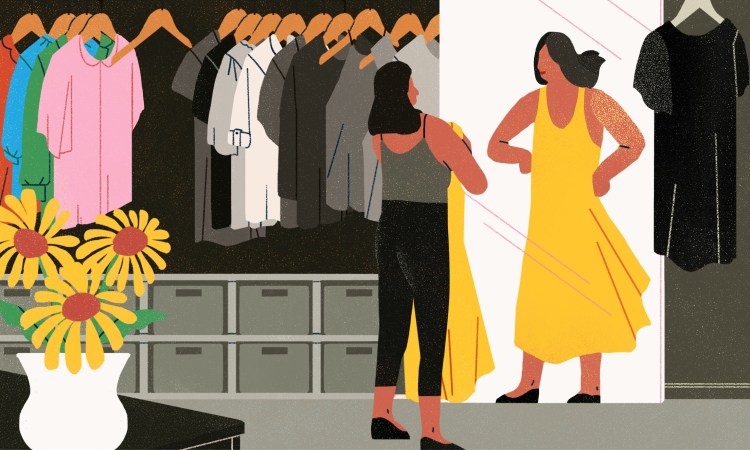
For most of my life, I thought about my color choices through the lens of what they said about me. Did I have the guts to rock red shoes? Would a pink dress make people take me less seriously? Perhaps that’s why I so often ended up with white furniture and black clothes.
My research on the aesthetics of joy has liberated me to choose colors based not on what others think but on how the colors make me feel. Noticing color and light has changed the world around me. Bright hues have become little gifts for me — small infusions of warmth and life giving me the power to make my own hearth, my own sun.
Excerpted from the new book Joyful: The Surprising Power of Extraordinary Things to Create Extraordinary Happiness by Ingrid Fetell Lee. Reprinted with permission from Little, Brown and Company, a division of Hachette Book Group, Inc. Copyright © 2018 by Ingrid Fetell Lee.