Dave Troy (TED Talk: Social maps that reveal a city’s intersections — and separations) makes “people maps,” graphics that visualize cities and communities by people’s interests rather than their geography. Here he looks at the divides in St. Louis, Missouri, and asks if we might use this kind of analysis to predict the next Ferguson.
Looking at St. Louis through the lens of social networks reveals some interesting insights about the racial divisions underlying the recent news stories about Ferguson.
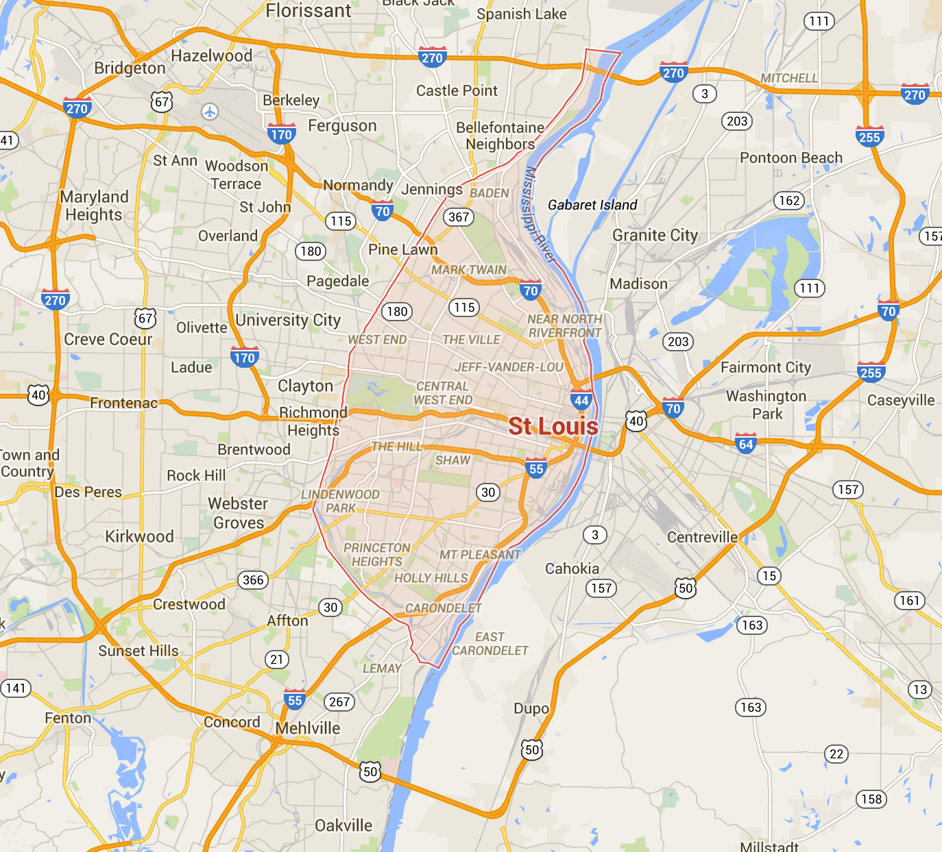
First, a little background: Ferguson is a small city (population 21,111 as of July last year) inside the St. Louis metropolitan area. The population is 67 percent African-American and 23 percent white. However, as Ferguson is so small, it’s difficult to get much information from social media about the people who live there. So to understand the broader context, we’ll look at the St. Louis metro area, which includes Ferguson — essentially the area inside the I-270/I-255 ring road around the city.
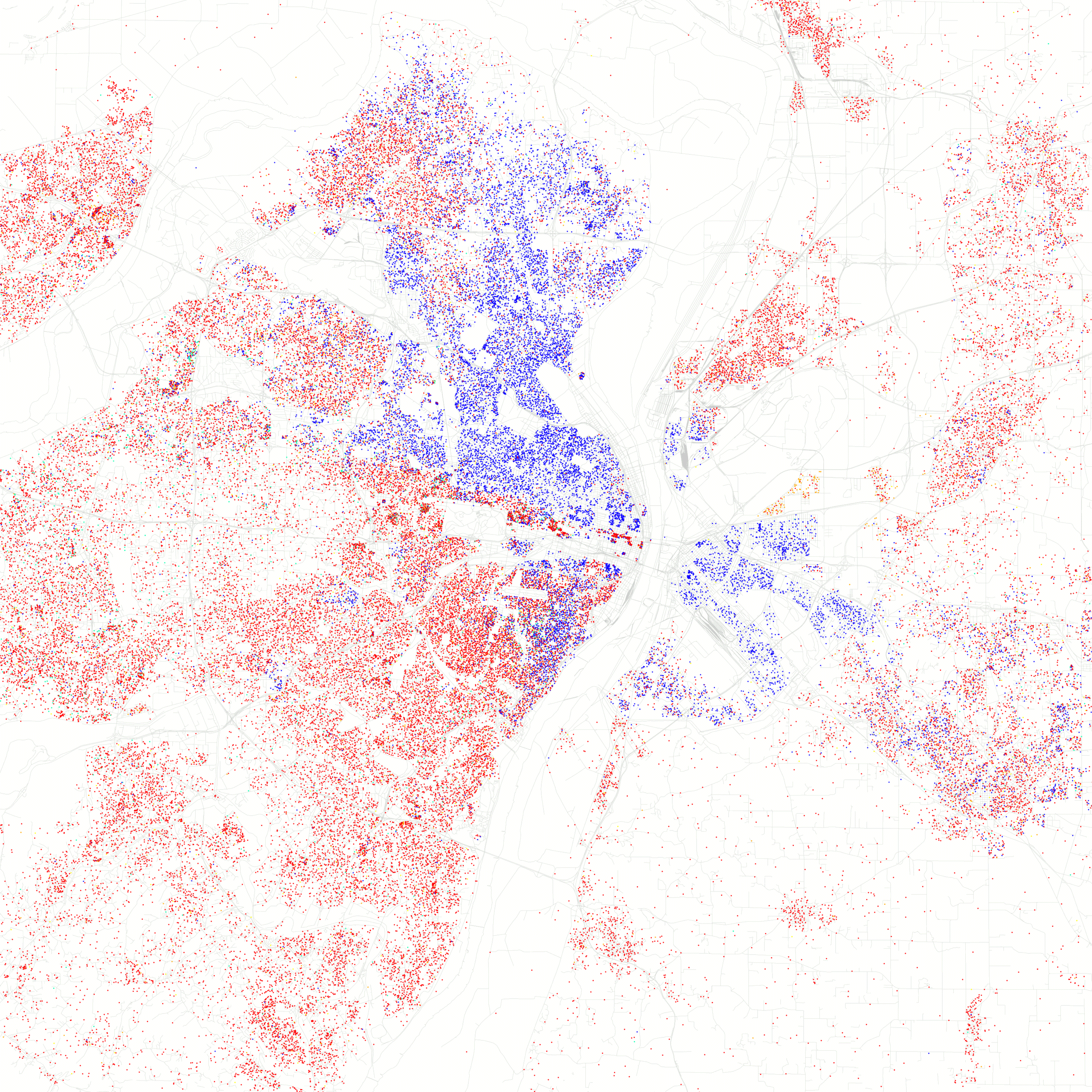
The population of the city of St. Louis is about 49 percent African-American and about 44 percent white. It’s also highly segregated, as this geographic map derived from 2010 census data illustrates. Blue dots are African-American people, red dots are Caucasian people, and each dot represents 25 people.
While these geographic maps show us that there are two very different populations living in a very segregated way, they don’t offer much insight into the social structure or cultural composition of the city.
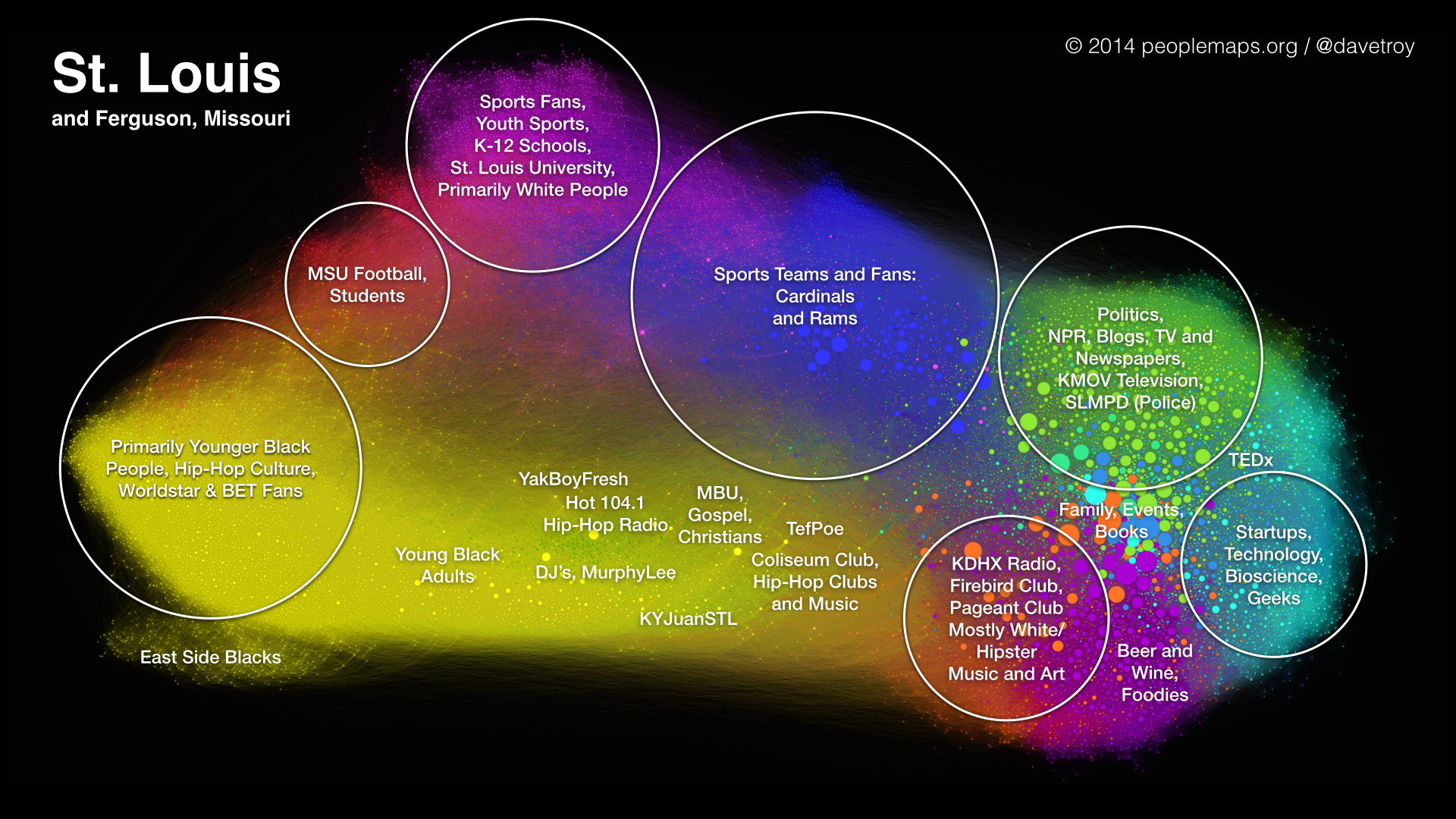
The map below offers a non-geographic view of the city. It looks at who people in St. Louis follow on Twitter, and clusters them into communities of interest:
But this fact isn’t surprising: Different people talk (and care) about different things. What is revealing is that these online networks are also strongly segregated racially. In St. Louis, black and white people have (with just a few exceptions) sorted themselves into two distinct communities, with little crossover in the middle.
At the right side of this map, we see a lot of brands, mainstream media, politicians, restaurants, magazines, radio stations — and geeks, including the local TEDx community. It’s almost all white. In yellow, from the left and along the bottom of the map, we see a very large community of African-Americans, and they are very well networked together — forming a large and tightly clustered group.
This map also works like a color wheel — groups at opposite sides of the map have the least in common. So young black hip-hop fans don’t interact with startup geeks, and hipsters aren’t so into youth sports. But what’s perhaps most disturbing about this map is the stark divide between black and white, and the distance between the two sides of the map.
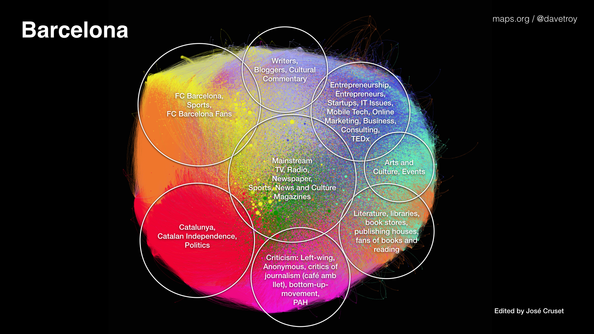
The map below of Barcelona (made with the same technique) shows something very different — that there is no major schism in the society, and its diverse networks are all pretty close together, even though they are distinct enough to identify as separate. [See: 7 more of my maps.]
Now, this isn’t to say that Barcelona doesn’t have its problems, but massive internal social unrest originating from a marginalized population doesn’t seem to be one of them.
So how do we know how to label the parts of the map, who’s talking about what, and what race they might be? You can read more about the overall methodology used, but for understanding race, we can determine it much of the time by looking at profile pictures.
Here’s a map of the St. Louis social networks, showing profile photos:
You can click on the map to zoom in and look at individual faces. The folks on the lower left are predominantly black, and everyone else is predominantly white. And businesses and brands are mostly on the right — and they are apparently businesses and brands that young black adults don’t have a lot of interest in.
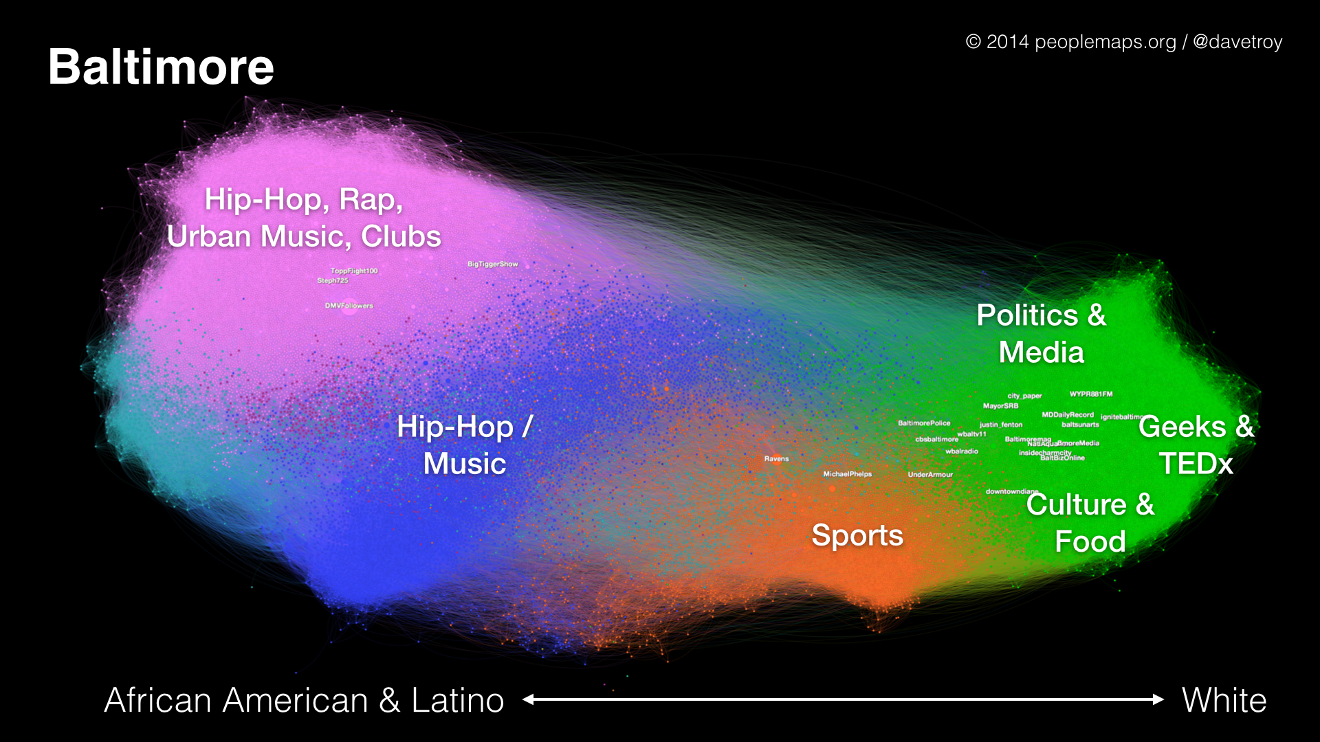
To put St. Louis into a broader context, it looks a lot like Baltimore:
The similarity in morphology is striking, but it raises the question: Can we use social data to detect places where racial tension is highest, and might erupt into social unrest? Cities with this kind of wide gulf between opposite ends of the network that are also accompanied by racial division should perhaps be the special focus of efforts to defuse racial tension.
The history of race and segregation in America is complex and nuanced, but maybe with these new tools we can raise our level of understanding of how to approach, measure and ultimately heal these longstanding divides. Because it’s imperative that we break the cycle of tension, conflict and unrest that currently characterizes American race relations.
Segregating ourselves by race is something we choose to do, and we can choose not to do it — because ultimately, we are stronger together than apart.

