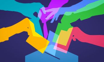
Every four years, the Get Out the Vote campaign invites graphic designers to make posters that rally US voters to go to the polls. Here, 14 posters that rock the vote.
Question: Where would the US feature on a list of the top 25 developed countries with the highest voter turnout in the world? Answer: Nowhere. The US is #27, with 53.6% of the eligible population voting in the 2012 presidential election. Compare that with the no. 1 country, Belgium, where 87.2% of voting-age citizens marked their ballots in 2014.
Low voter turnout in the US is nothing new, of course; it’s a problem almost as old as American democracy itself. Reasons include the inconvenience of Election Day being a Tuesday, a confusing registration process, disenfranchisement of some voter groups, lack of trust in politicians and political institutions, not to mention a decline in civics education. So in 2000, graphic design organization AIGA launched its Get Out the Vote project to enlist its members to create original posters to encourage voting. “It’s not enough to say, ‘Go vote,’” said renowned graphic designer Milton Glaser (TED Talk: Using design to make ideas new) on the AIGA design blog this year. “You have to justify that.”
Here are 14 posters from the 2016 GOTV gallery that showcase a variety of inventive approaches aimed at galvanizing Americans to go to the polls on November 8.
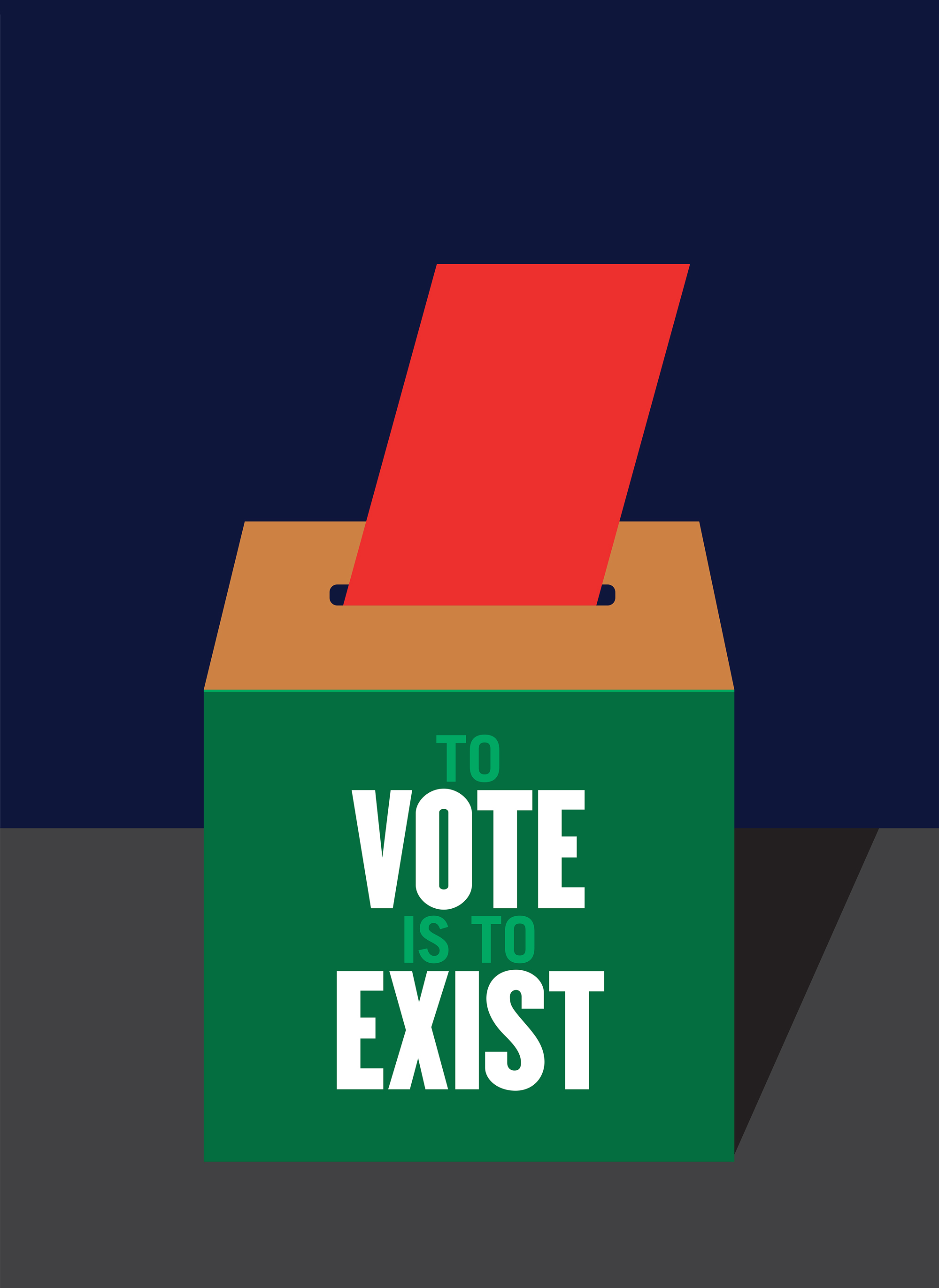
You won’t be seen if you don’t vote
New Yorker Milton Glaser is behind one of the most visible and imitated public advocacy campaigns ever: the 1977 “I Love New York” campaign. Of his poster, he hopes at least one viewer will be moved by it to head to the polls. In keeping with his streamlined style, he chose a succinct slogan and paired it with simple graphics. “For me, if you don’t vote, you’re essentially invisible,” he said on the AIGA blog. “And you don’t affect the structure of your own life, or anyone else for that matter.”
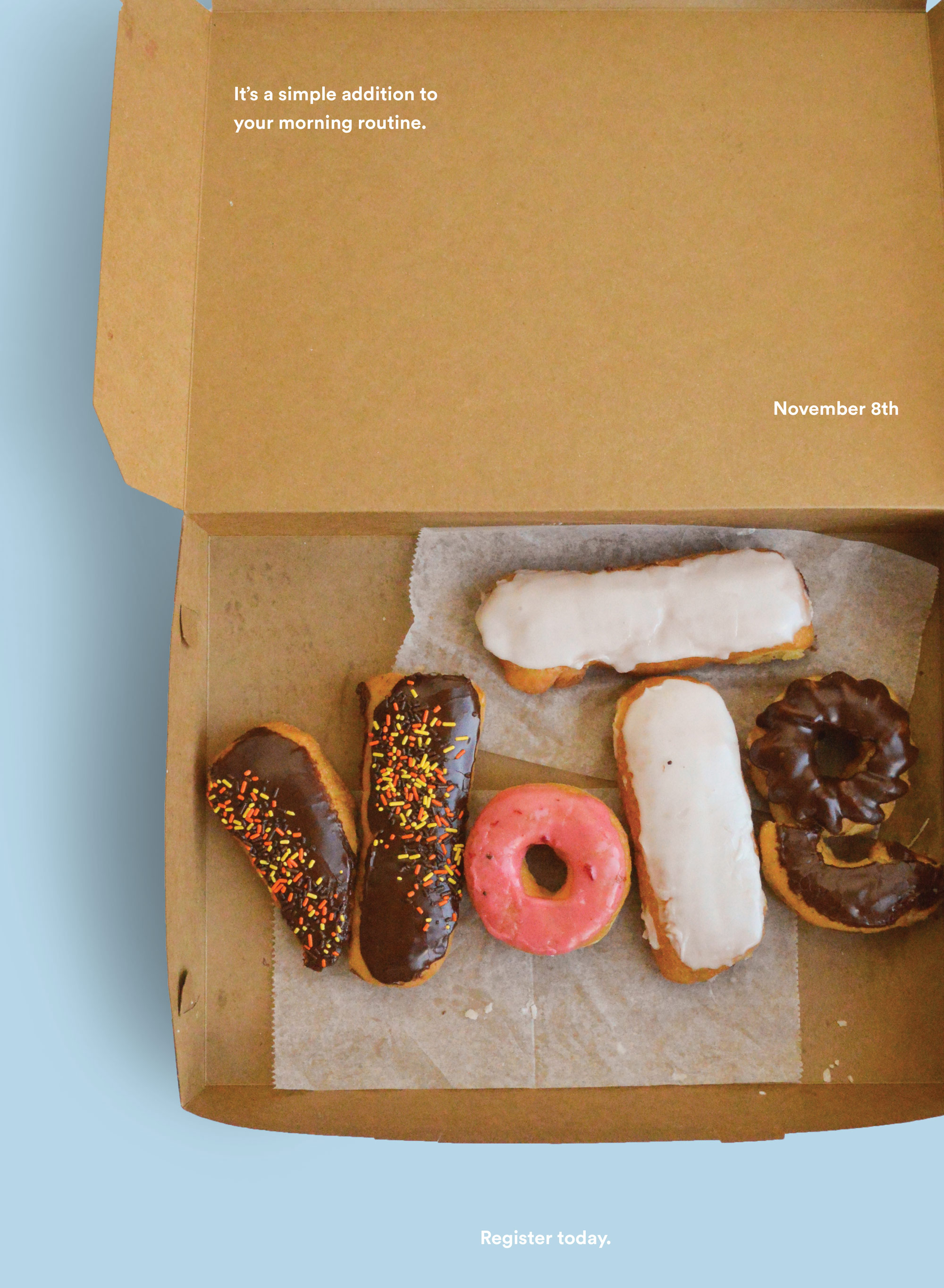
Voting is part of your morning routine
Natalia Warren, a graphic design student at Judson University in Elgin, Illinois, did a bit of mental time travel when conceiving her poster. “I was imagining waking up on November 8th and what Election Day would mean as opposed to any other day,” she says. “I realized that voting wouldn’t be much of an interruption, and that’s a concept I decided to go with. It’s voting as a simple addition to your morning.” She played around with visuals of coffee cups and different breakfast foods before opting for donuts. “I follow Stan’s Donuts on Instagram, and their images are always a fresh contrast with the rest of my feed,” she says. This is Warren’s first chance to vote in a presidential election, and she thinks one way to boost voter turnout would be to appeal to people’s wallets: “Companies should offer discounts in their stores on November 8th for people wearing their ‘I voted’ sticker,” she suggests.
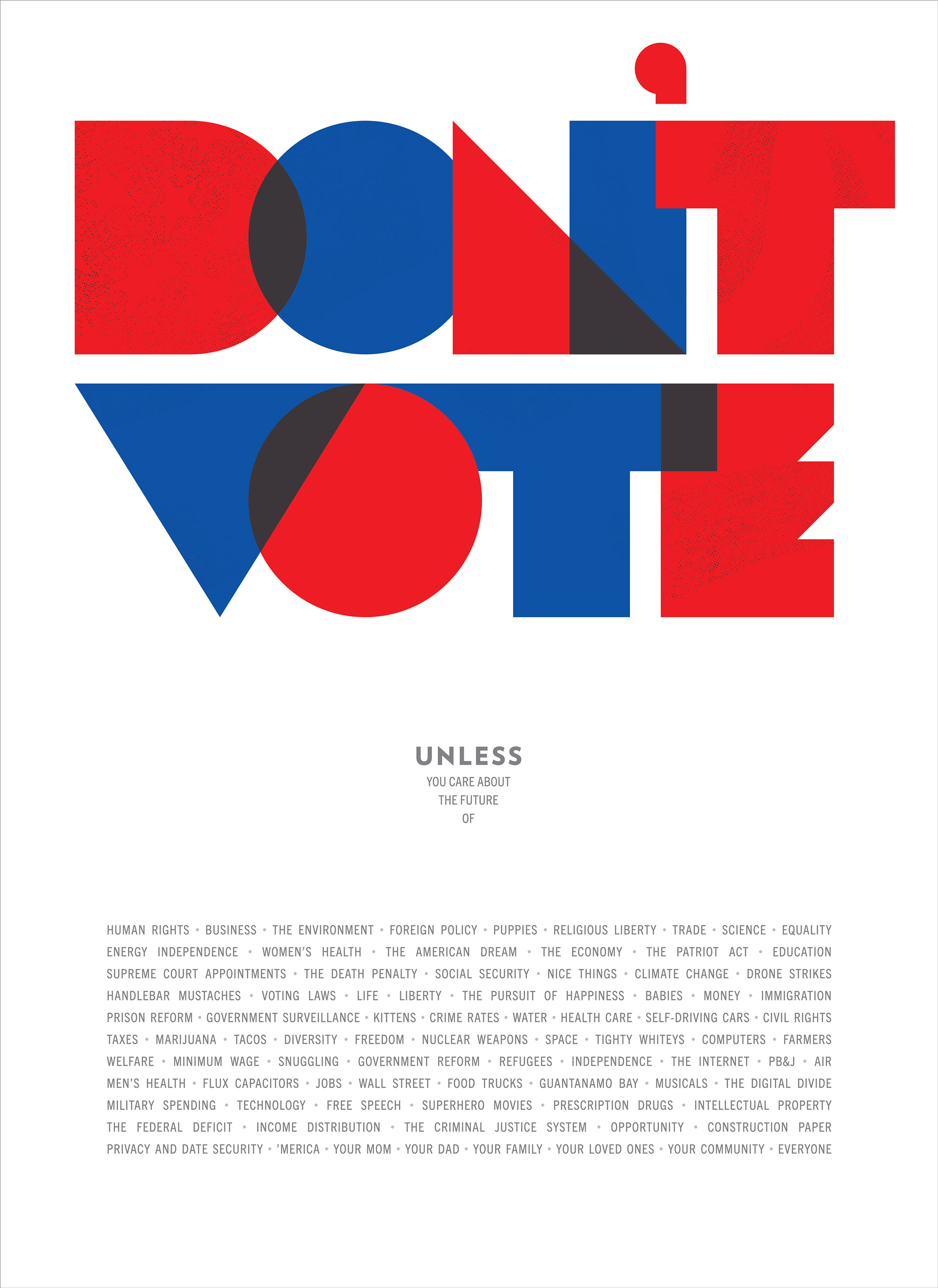
Let’s celebrate voting
“Bold, eye-catching color and clean type” were two goals for this poster, says designer Chris Sim of branding firm New Kind in Raleigh, North Carolina. Political ads of the ’60s and ’70s were a specific reference, “a blend of patriotic and psychedelic that only that era could have produced,” says his New Kind collaborator, writer Craig Carter. The pair came up with a lengthy list of reasons for voting, ranging from the straightforward (human rights, the environment) to the tongue-in-cheek (pb&j, your dad) to appeal to every kind of voter. The ultimate effect is inclusive and enthusiastic. “I don’t understand why Election Day isn’t a national holiday, “ says Carter. “What’s more American than participating in the democratic process? We should celebrate it.”
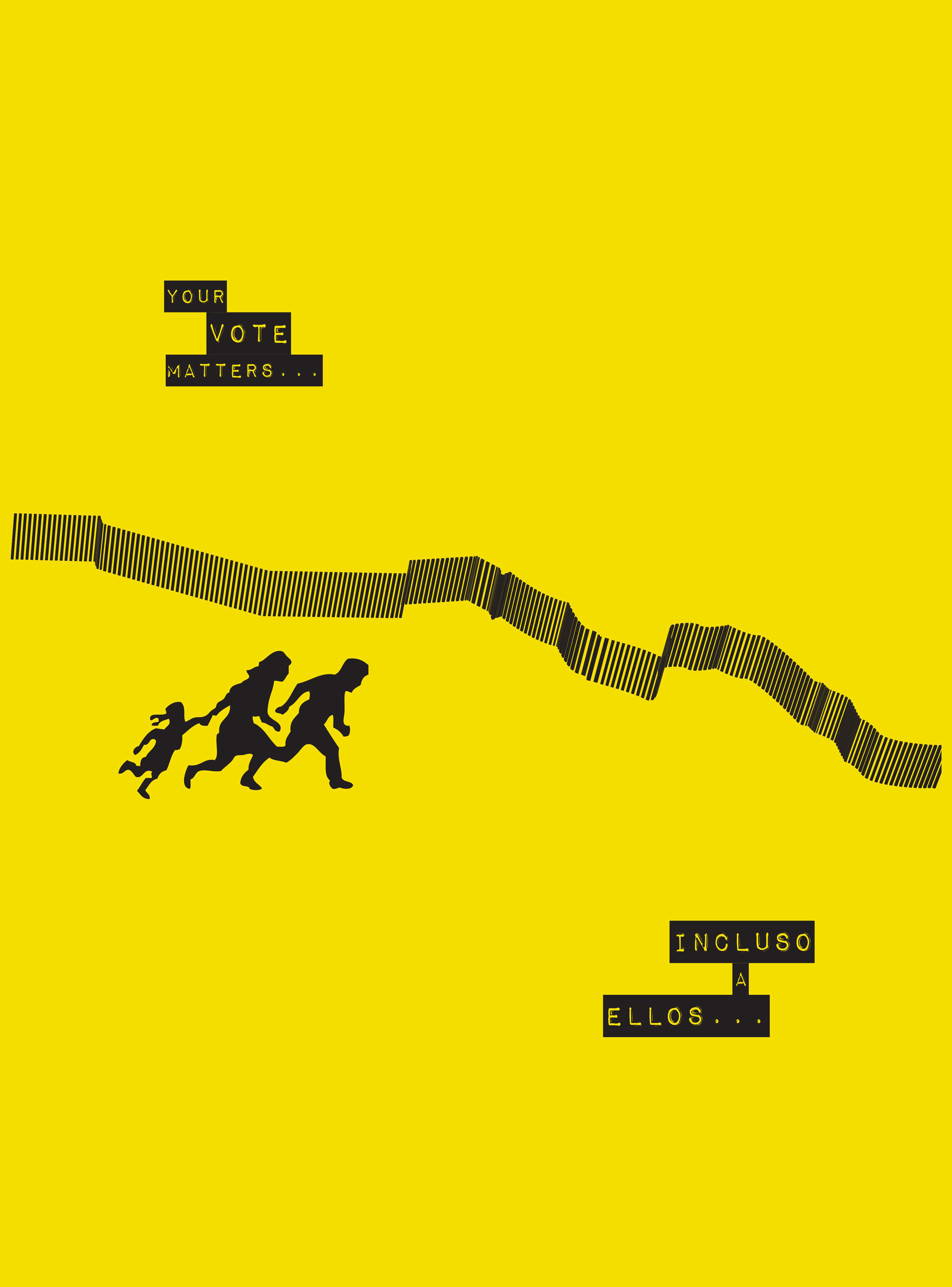
Immigrants’ votes matter
The poster by Jesus Garcia, a designer from Phoenix, Arizona, plays off a familiar sight to Californians: a warning sign cautioning drivers to look out for immigrant families crossing the highway. He added a jagged border fence and the words “Your Vote Matters” and, in Spanish, “Even Them.” Garcia is a first-generation American — his parents moved from Mexico — and his intended audience is other Latinos, whether recently arrived or third generation. “I want them to take a second to think about where their families came from,” he says. “Their vote does matter more than ever, not just for president but for local offices like state representatives and sheriffs.”
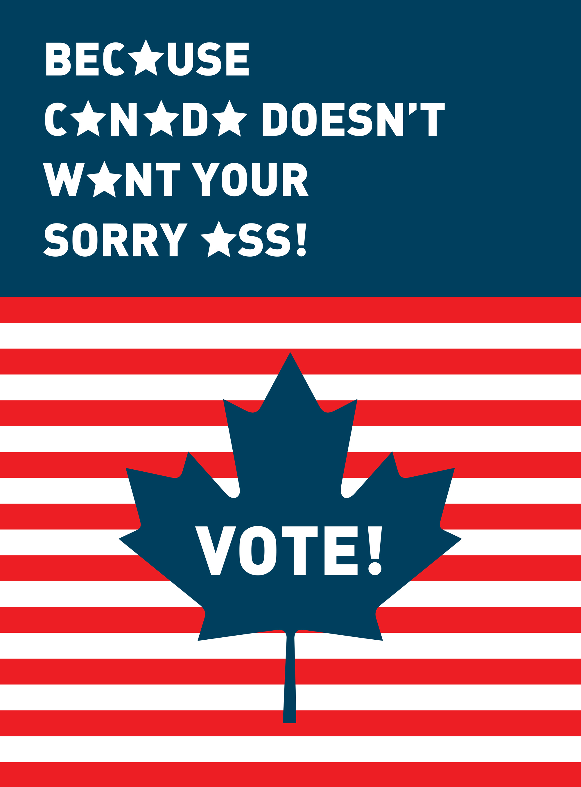
Heading north won’t solve problems
The design of Kevin Kernan, a principal at design studio GDLOFT in Philadelphia, plays off the hyperbolic statement that many Americans make every four years. “Every presidential election, I hear so many people say, ‘If my candidate doesn’t win, I’m moving to Canada,’” he says. His design plays off that familiarity, both in words and in national flags, and aims to puncture the threat with a bit of humor: “You can’t solve this country’s problems by running to another one when times get tough.”
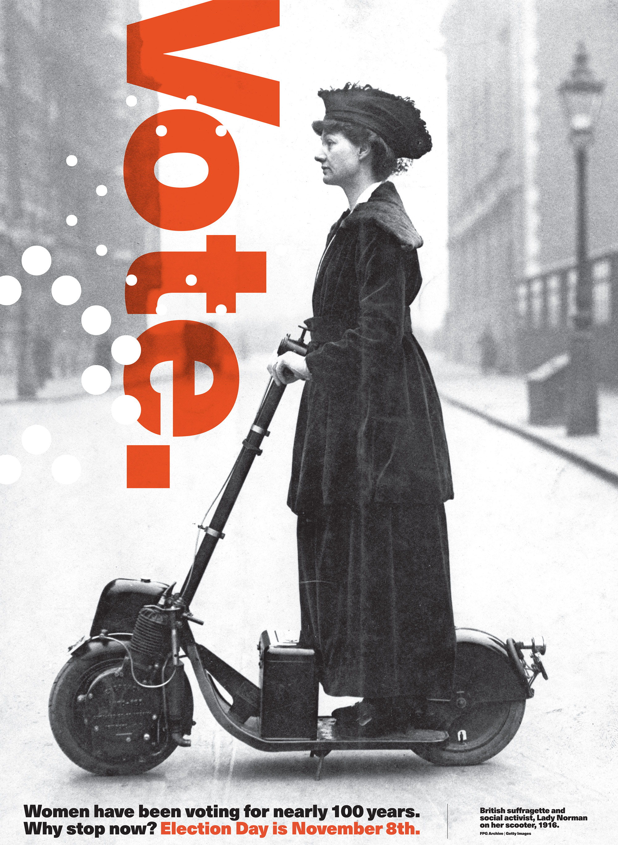
Voting can be playful — yet purposeful
Jessica Helfand, who is an artist-in-residence at Yale University, co-founder of the Design Observer blog, and author of the new book Design: The Invention of Desire, admits, “I’m obsessed with photography and, in particular, with the photographic portrait. So I often begin with actual images that tell stories and build out from there.” For her poster, she was captivated by this archival photograph of a British suffragette, saying, “I loved her spirit, her sense of purpose — and that scooter!” Helfand believes that low turnout in the U.S. is tied to a deficit in education. “Without education, we are prisoners of sound bites that introduce turnkey solutions to things we can’t access,” she says. “Maybe if every school child in America were obliged to follow Nate Silver on FiveThirtyEight, we’ll see more citizen engagement — and better voter turnout — a generation from now.”
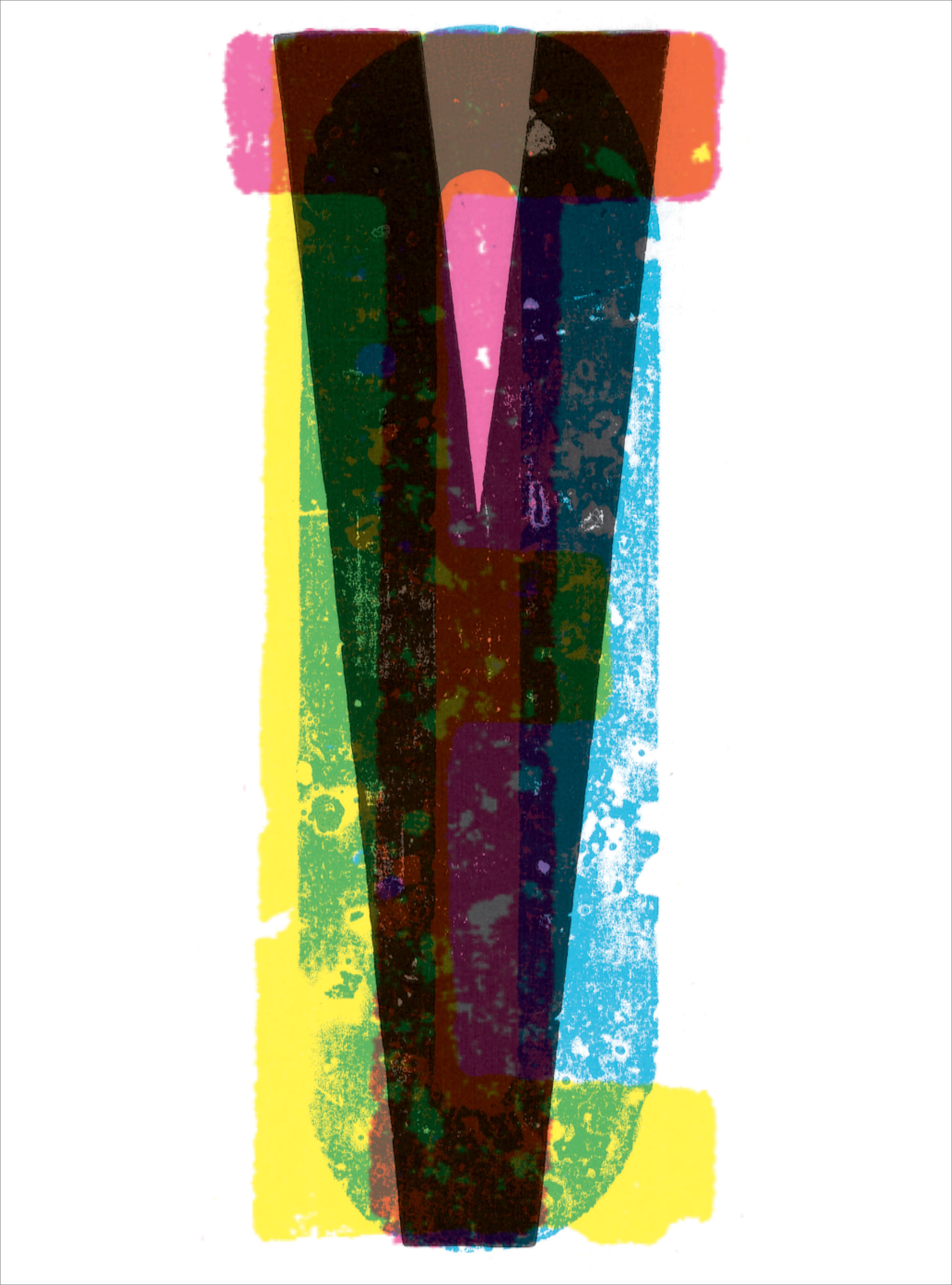
Voting is everyone’s duty
The techniques and details of the design of the poster from Cesar Rivera, assistant professor in graphic design at Sam Houston State University in Huntsville, Texas, try to speak to voters on multiple levels. “The concept of overlaying colors corresponds with ballots piling up in a ballot box and how we all come together to select a candidate,” he explains. “[Four-color] CMYK [cyan, magenta, yellow, and black] are used in the printing process, but they’re also used to represent people from all cultures and socio-economic standings. The condensed typeface represents the narrow ballot ticket.” His design’s handmade feel is meant to appeal to Generation X and millennial voters. Rivera, who served in the US Army as a medic, sees voting as not only a right but “a duty to my country,” and he believes that people’s faith in democracy could be renewed if politicians exhibited greater civility and a willingness to compromise.
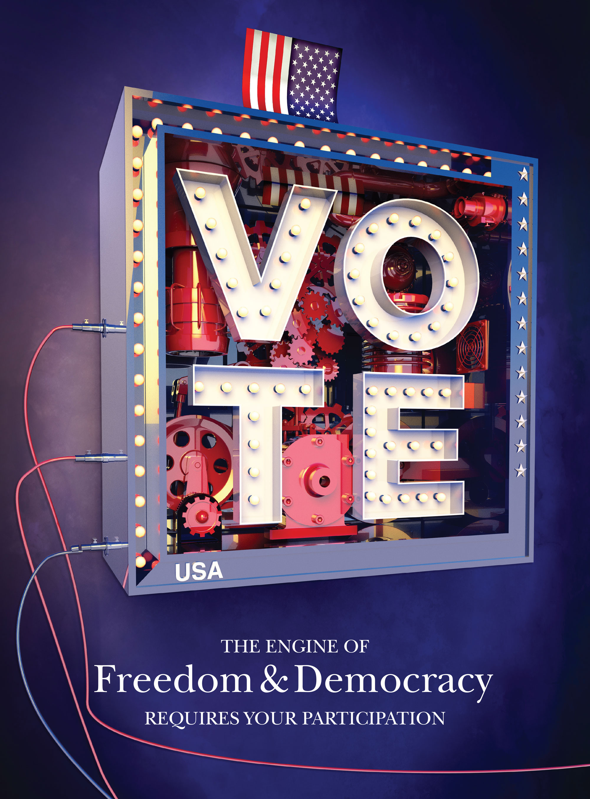
Politics needs clarity
Jon Buckley, creative director at financial services company Northern Trust in Chicago, has been experimenting with dimensional typography and digital dioramas, influences which can be seen in his voting poster. He was also inspired by America’s long history of political cartooning, which has served as a shorthand form of information and criticism. Voter turnout could be raised, he thinks, when elected officials not only offer their specific plans of action but also follow through. “Politicians need to tell voters what they will do and then actually do it,” Buckley says.
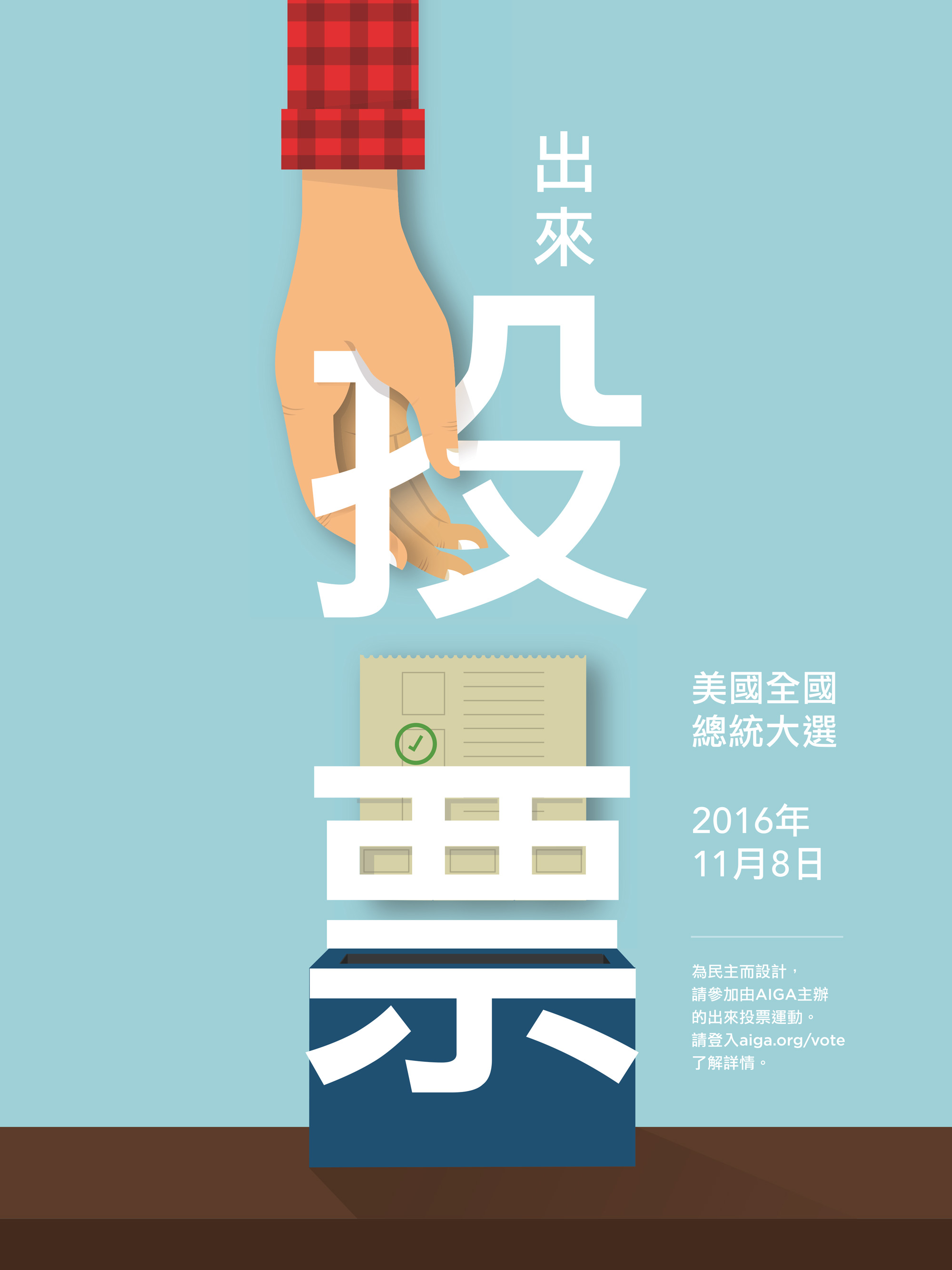
Invite Chinese-Americans to the polls
Of this poster, Jenny Lam, design director at Amazon Digital Products in Seattle, says, “I wanted to reach and empower Chinese-Americans. I’m the daughter of immigrant parents, and it took me nearly 20 years to register my father and mother to vote.” The inspiration for Lam and her co-creators, Candy Chan and Tom Chang, was the ChinEasy project by ShaoLan Hsueh (TED Talk: Learn to read Chinese … with ease!) that teaches Chinese characters through a combination of visuals and pictograms. The primary characters on Lam’s poster mean “Go Vote.”
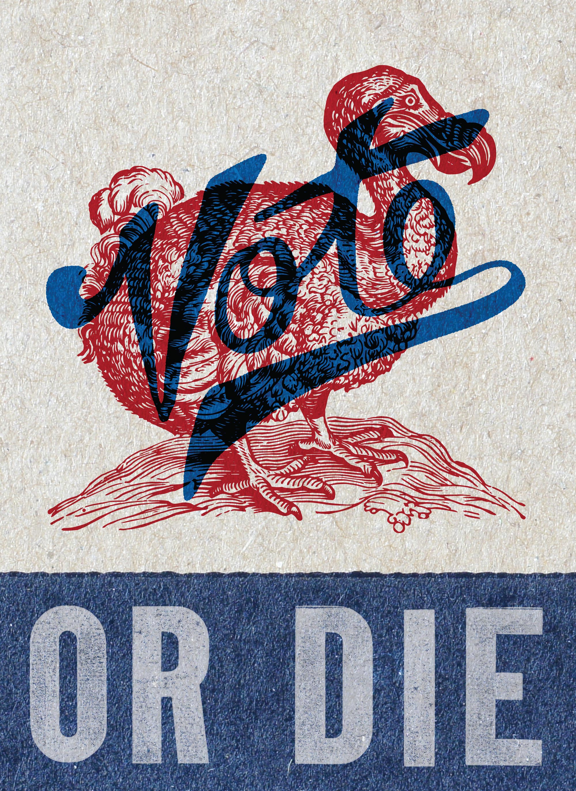
Vote — or risk extinction
Robbie Knight, an Oklahoma City graphic designer, began his poster by hand-lettering the word “Vote.” He originally began researching illustrations of eagles, but when he came across a vintage dodo drawing, he found another way to convey a pro-voting message. “I wanted this to have that old gig-poster feel, like something you’d find at [Nashville letterpress shop] Hatch Show Print.” Besides AIGA’s Get Out the Vote initiative, he’d like to see other “creative campaigns that engage voters in thoughtful and unique ways.”
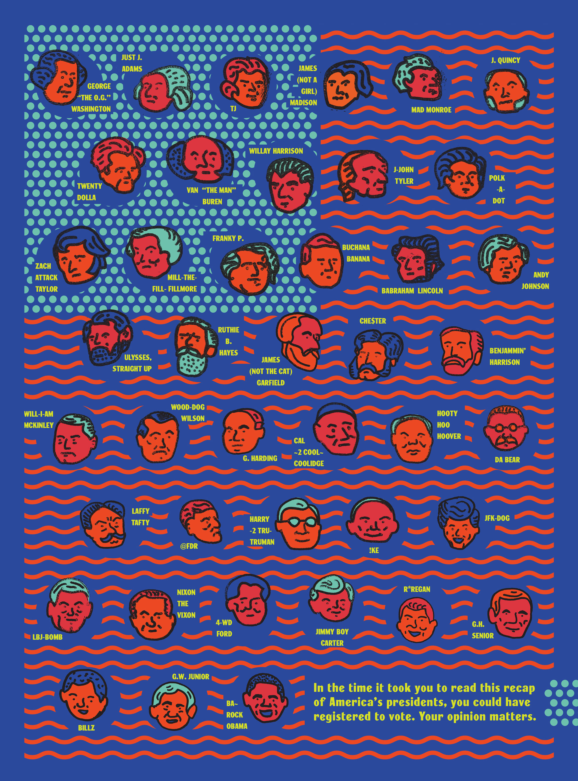
Delight people into voting
Visual communications student Sarah Hinman, who attends the University of Kansas in Lawrence, did research on voter turnout before she began drawing, and she learned that many people complain that registering, as well as voting itself, took too much time. She says, “I wanted to reel people in to read the nicknames I gave each president and by the end of it, remind them that they could have registered or voted in the time that they had just spent.” Hinman’s graphics were influenced by the textures and illustrations of Seymour Chwast and Corita Kent; she was also inspired by album artwork from the bands Twin Peaks and Car Seat Headrest. To amp up the youthful effect, she chose a a punchy red-orange and a bold indigo as a twist on patriotic red and blue.
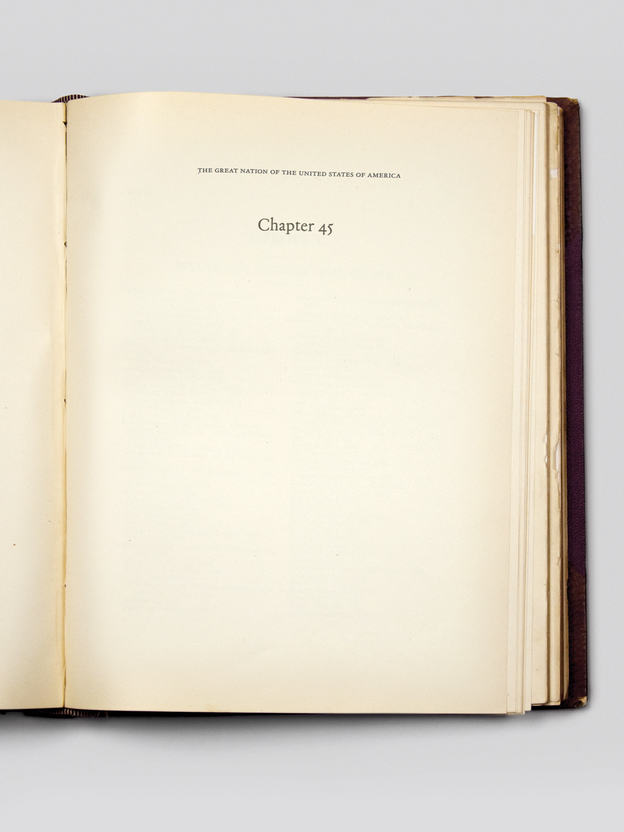
Write America’s next chapter with your ballot
Designer Drew Davies and his team at Oxide Design in Omaha, Nebraska, went for a cerebral and spare approach. For their poster, they used the metaphor of American-history-as-a-book. As he puts it, “the term of our 44th president is coming to a close, so the 2016 election represents our opportunity to write the next chapter with our vote.” Davies, whose firm works in ballot and election design at the federal, state and county levels, says, “A legacy of bad design in elections has created a widespread impression that voting is more complex or daunting than it really is.”
Voting merges all our voices
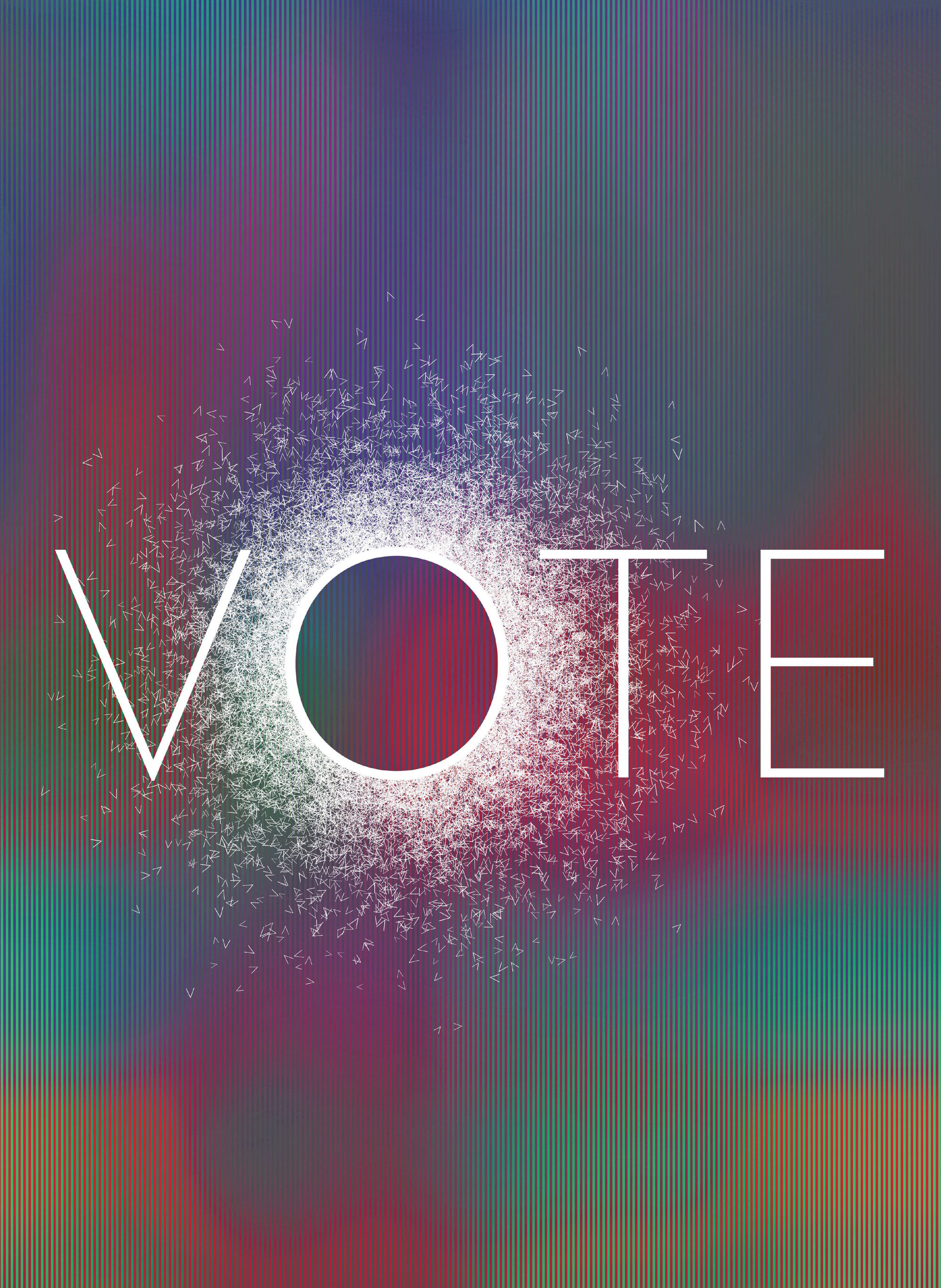
In the hands of Jeremy Botts, professor of art and design at Wheaton College in Wheaton, Illinois, the partisan becomes impartial. Inspired by the work of designer John Maeda, he turned to the websites of Donald Trump and Hillary Clinton, selected images, and blurred them. Then he melded them in lenticular fashion, digitally cutting each image into hundreds of thin strips and alternating the strips for a compelling, hypnotic effect. “In adding something to the overwhelming visual culture that the Internet has become, I do so with trepidation and carefulness,” he says. “So rather than adding another shout, I wanted to provide a small, meditative space.”
Suffragette struggles can inspire us to vote
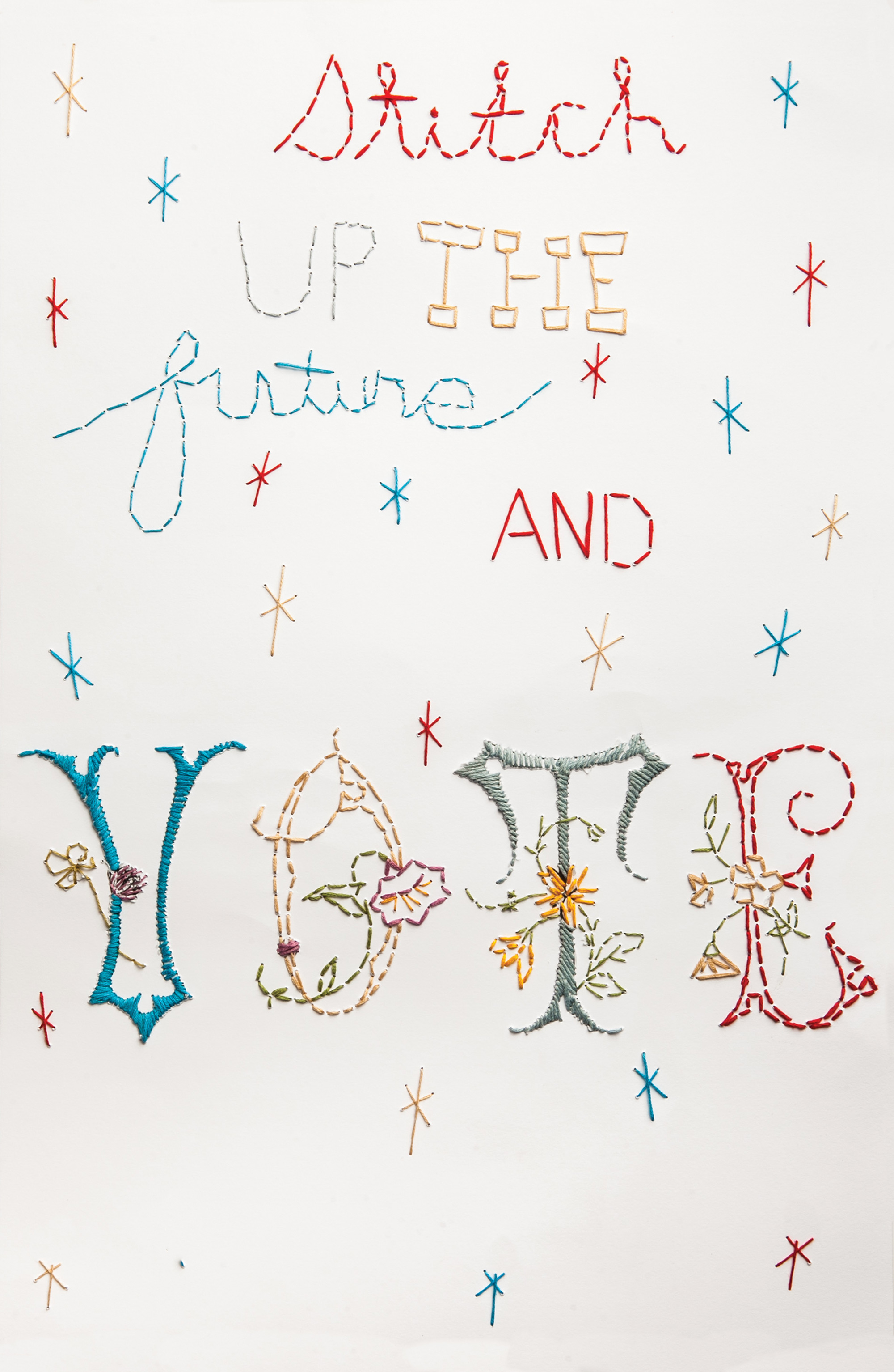
Alexandra South, an account manager for a creative agency in El Paso, Texas, says she isn’t a graphic designer; she’s an artist and “textile arts are my favorite medium.” She wanted to hand-stitch her poster and as she began to research older embroidery and lettering, she discovered images of textiles that women’s suffrage campaigners had made while in jail for protesting. “Their prison embroidery stitches were uneven, un-patterned, free-hand stitch work done with bits of thread from their clothing and bedding,” she says. She mimicked that effect for the top part of her poster and chose Art Nouveau lettering for the word “Vote,” and she hand-stitched the entire creation in threads of muted shades of red, white and blue. “When we reflect on history and remember how powerful the suffragettes were when they came together, we can draw inspiration that we can continue to drive women’s rights in this country,” South says. “We are mothers, daughters, decision makers and a force to be reckoned with.”

